Ranking all 32 2022-23 NHL Reverse Retro jerseys

It’s throwback time, baby.
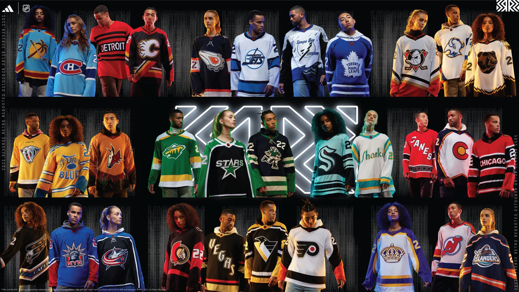
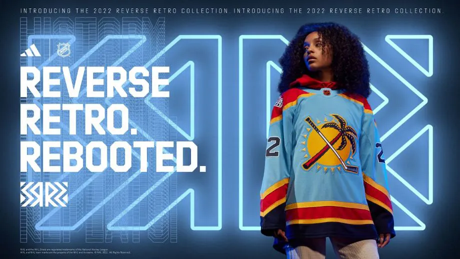
The NHL, in partnership with Adidas, announced the second wave of Reverse Retro jerseys after a successful first run in 2021. The concept is to mix old themes with new elements, such as color schemes, logos or altered designs.
It was popular the first time, and it’s definitely going to receive substantial discussion this time around.
Some people love the new rollout, while others have mixed feelings. In the end, it’s all a cash grab for the teams, the league and Adidas. But it’s always nice to see new uniforms, and when they take elements of previously popular designs, that’s a plus in my book.
So, here’s a breakdown of all 32 Reverse Retro 2.0 jerseys, from best to worst:
1. Los Angeles Kings
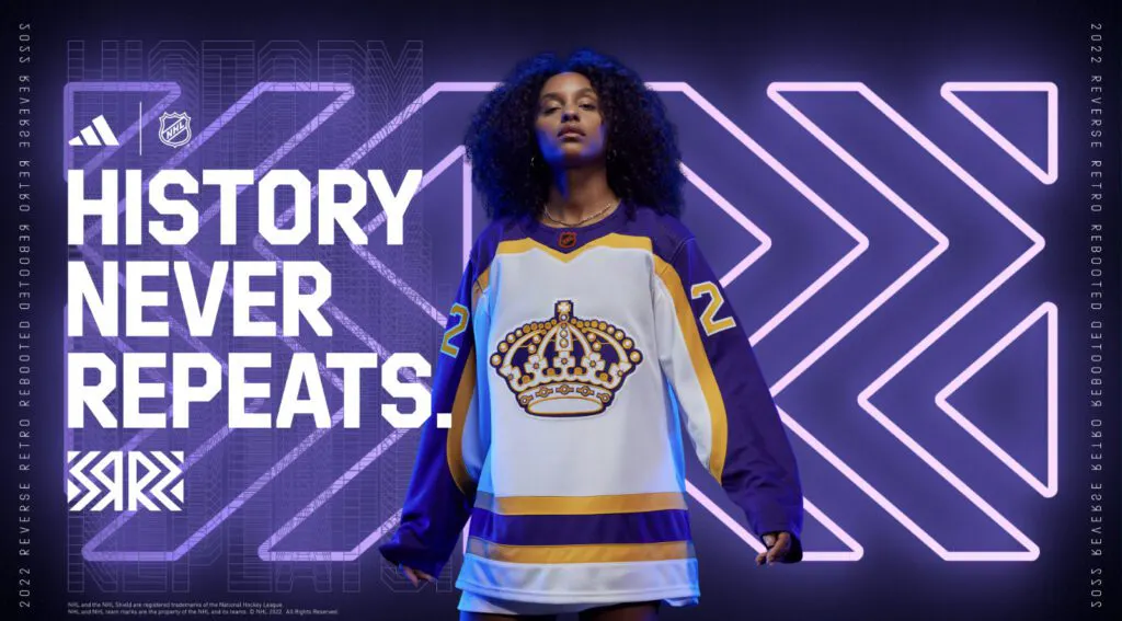
It’s hard to screw up these colors. They could have used any logo and made a winner out of them. The design is similar to the 2021 iteration, but the logo that dominates the front is commanding here.
2. Colorado Avalanche
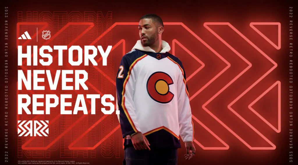
An easy favorite here. They did the Nordiques jersey already, and they don’t have many others to choose from in the Avalanche era. The inspiration for this one was the Colorado state flag, which is simple enough. You’ll notice the Avalanche’s trademark peaks at the bottom of the uniform give it a more modern touch.
3. San Jose Sharks
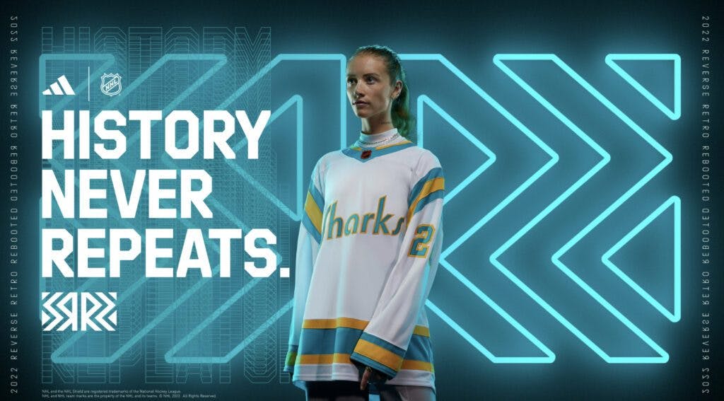
Nice. The California Golden Seals were a dreadful team, but, dammit, they knew how to look good anyways. San Jose brought the design back with its own name on the chest and it just fits so well. Matched with the team’s new all-teal look for the normal homes, the Sharks have one of the best all-around looks.
4. Vegas Golden Knights
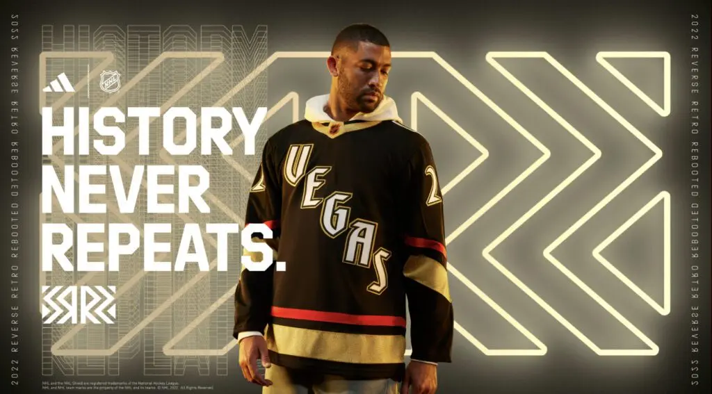
The Golden Knights said this is based on what they THINK their jersey could have looked like in 1995. Uh, okay? Sure? But, hey, it looks sharp, using a black base with red and yellow striping. The Vegas wordmark is bold and beautiful, too. It’s hard for Vegas to really do much here, but it at least looks great. Bonus points because also glows in the dark.
5. New York Islanders
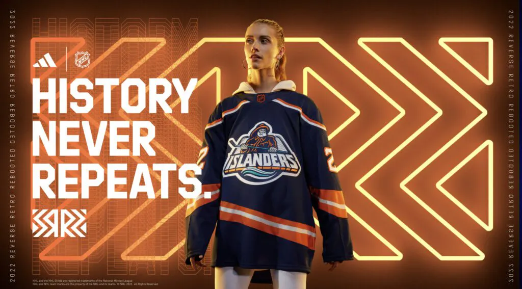
The Fishsticks are back! The design wasn’t favored during its initial run during the 1990s, but after slowly reintroducing it through merchandise sales in the past, fans have seemingly warmed up to the look. They nailed it here. The logo just pops so well and the striping gives it a more modern look from the old swoopy design it originally had.
6. Washington Capitals
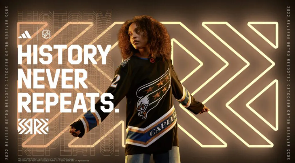
The Screaming Eagle returns! The mid-’90s-to-mid-00s jersey was definitely unique with its diagonal striping and it returns in a somewhat familiar black, teal and bronze design. We never got a black version with the eagle, so this feels like something that we could have seen back in the 1990s had they elected to skip the White House logo altogether.
7. Vancouver Canucks
Everything about this just works. The integration of the Johnny Canuck logo is a plus. The Canucks have had so few duds in franchise history, and I hope we see more of this design moving forward. Sure, it looks pretty close to Abbotsford’s AHL jersey, but that one looks excellent, so why not?
8. New York Rangers
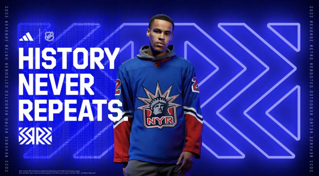
The Rangers were one of the winners from the 2021 RR series and they didn’t change much this time around. It’s essentially just a recoloring of the main blue to match the team’s usual royal blue. If it works, it works, and it’s always nice seeing the Lady Liberty logo in the rotation.
9. Nashville Predators
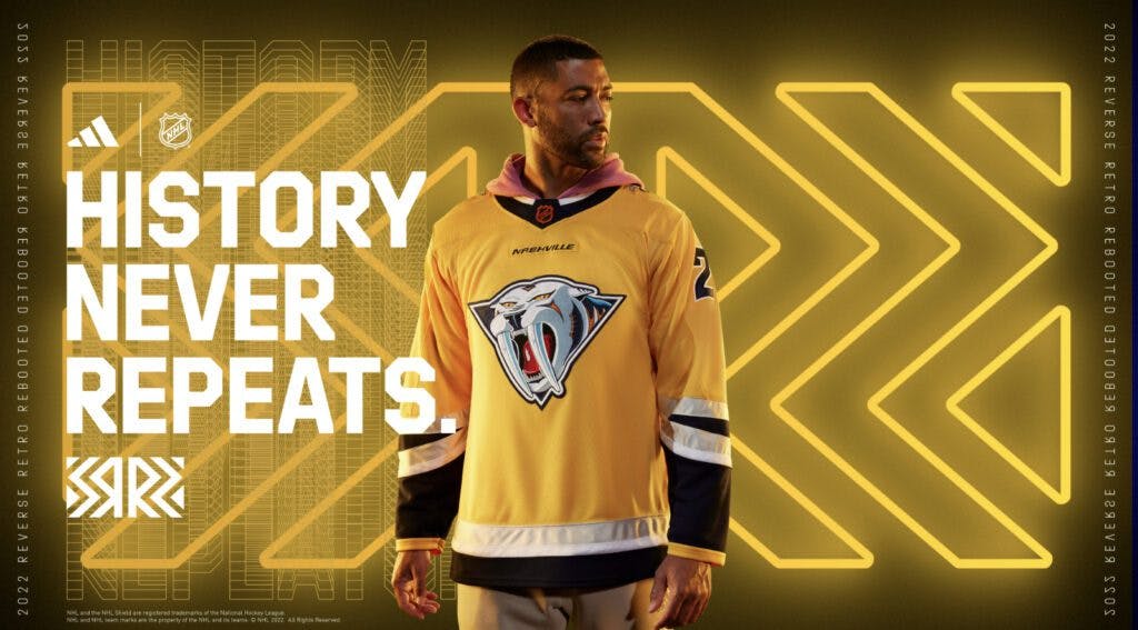
Their current shade of gold with the awesome sabertooth logo makes this an instant winner. Thanks for not bringing back the mustard color they donned during the early 2000s. Fun fact: the Sabercat is the logo our Mike McKenna wore when the Predators drafted him in 2002, and he’s a big fan of this revised look.
10. Montreal Canadiens
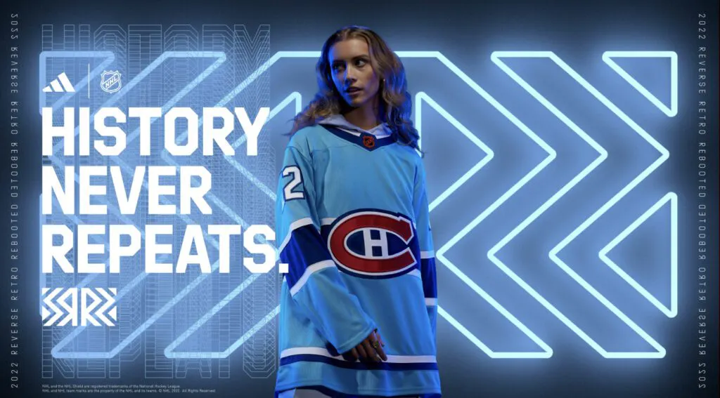
The Canadiens said these designs are based on the 1979 Stanley Cup-winning squad. Sure, I guess. Just say you miss the Montreal Expos and move on. The baby blue is iconic, and Habs fans have been looking for it to be incorporated for years. This works, but it’ll be interesting to see how people without an emotional attachment to the Expos feel.
11. Boston Bruins
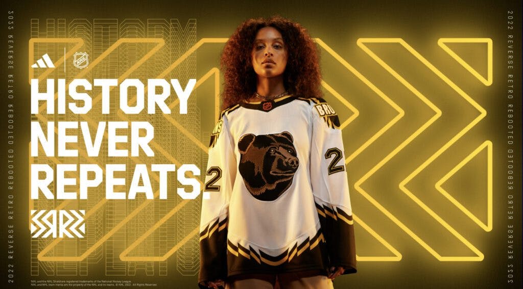
Ah, the Pooh Bear is back! The Bruins used it on their alternate from 1995-2006 and it was truly one of the better third jerseys at the time. Now it’s on a white background, which allows the logo to pop a bit better than on its older golden counterpart.
12. Florida Panthers
This probably would have stood out more had the color not matched Montreal’s. Still, it’s a beautiful design and the first real use of the palm tree/hockey stick logo in a meaningful way. Just wish there was more contrast in the number colors, but at least the blue is light enough as a main.
13. Pittsburgh Penguins
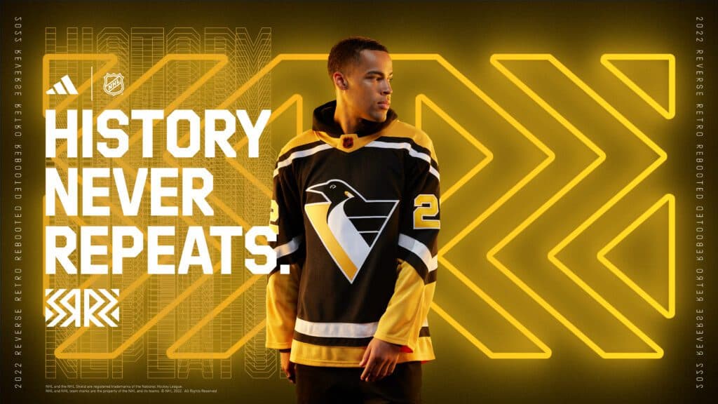
All hail Robo Penguin! This is a reverse of the white home jersey they wore from 1992-95, and it definitely would have fit perfectly back then, too. The gold numbers are a nice touch.
14. Anaheim Ducks
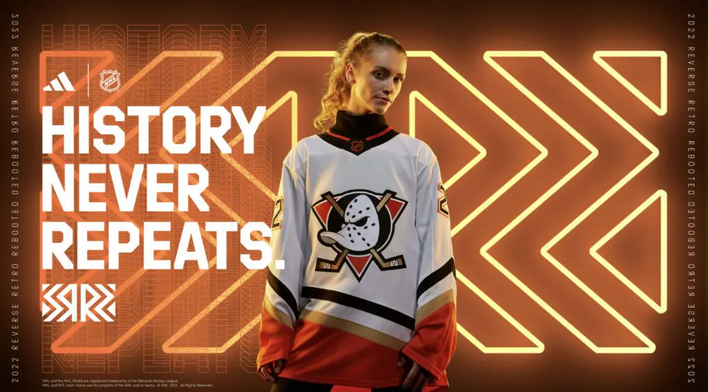
Hard to screw this one up. The Ducks had one of the best logos in NHL history when they first entered the league, and this matches more of the team’s current color scheme. The striping works, the logo re-color is nice and the orange makes it a bit more unique.
15. Buffalo Sabres
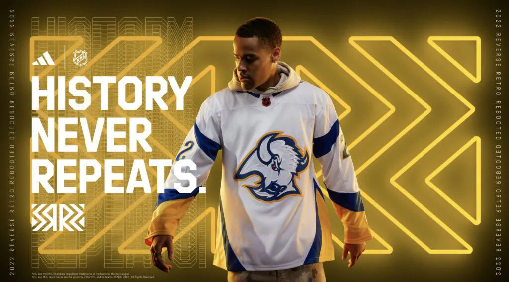
This feels like the perfect mix for fans that liked the Goat Head but didn’t like the red and black color scheme. What knocks this one down is there isn’t a ton of color contrast when the white and gold meet, but it’s still one that should have no issue selling this year.
16. St. Louis Blues
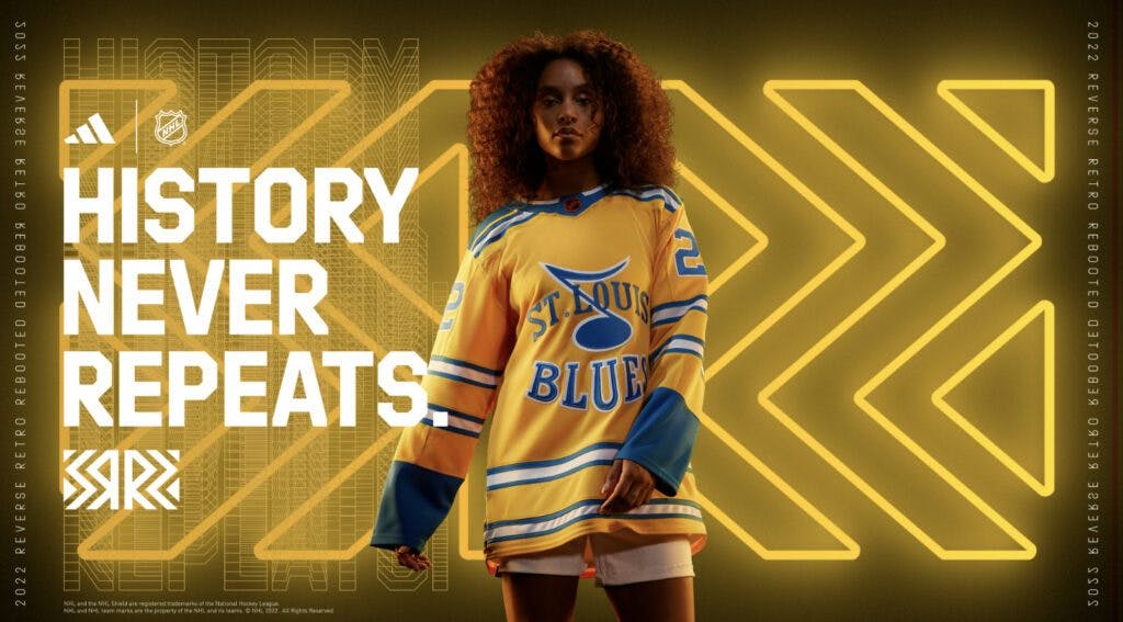
Prototype designs are always so cool to see, and this brings to life a logo the team used before finalizing what eventually became the traditional blue note. This is the first time the Blues have worn a primarily golden jersey, too. Come to think of it, this truly feels like the most “throwback” of the bunch, but it’s probably a good thing this logo didn’t become the standard.
17. Edmonton Oilers
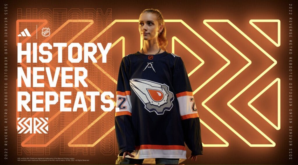
The jersey design is great, and the orange accents are solid. The orange oil drop inside the gear, though, seems unnecessary when the original navy version looked great in the past. It definitely could have been worse.
18. Detroit Red Wings
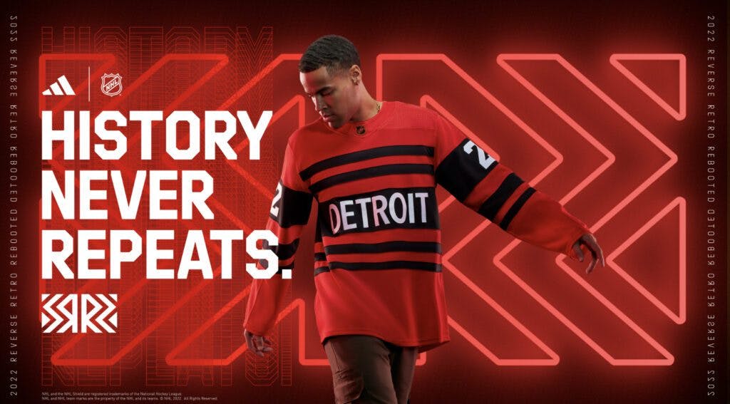
Detroit’s first reverse retro looked great if we’re comparing it to knockoff designs from Target. But this time around, this design screams “BOLD” with the red and black offset colors and the big “Detroit” on the front. This is a new take on the team’s 1991 75th anniversary design, and it’s solid.
19. New Jersey Devils
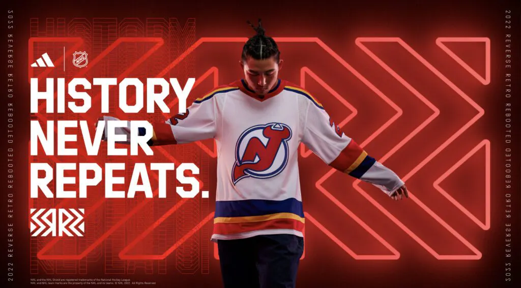
Because we can’t get enough Colorado Rockies designs, New Jersey followed suit and updated the team’s look from 40 years ago. The old Rockies layout is essentially the same but with the Devils logo slapped on it. It’s fine, but nothing too special.
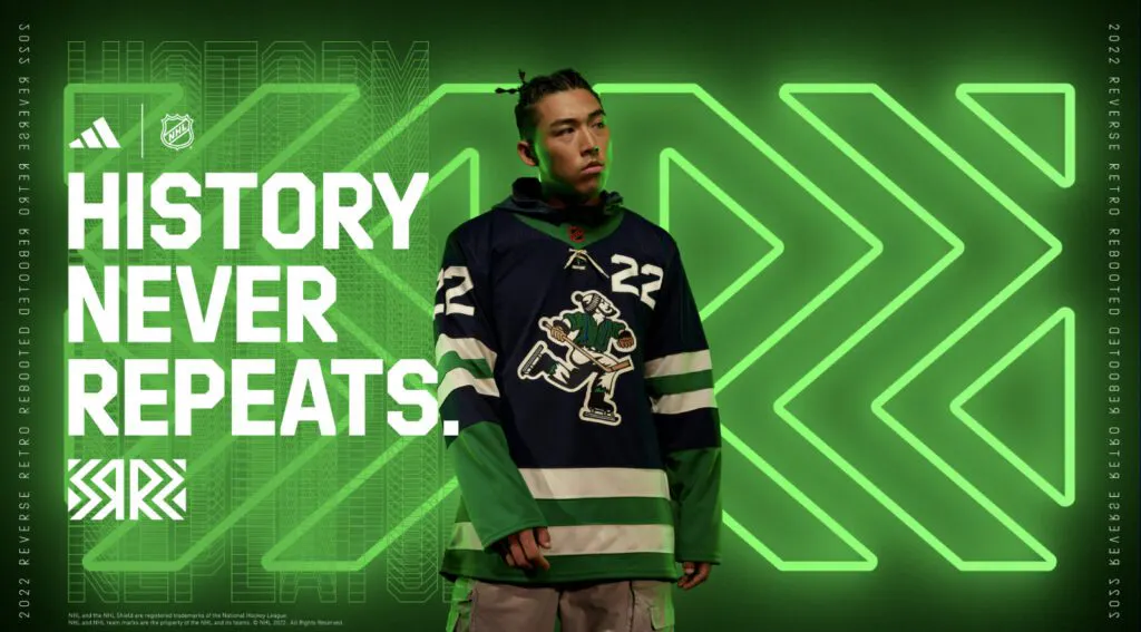
20. Minnesota Wild
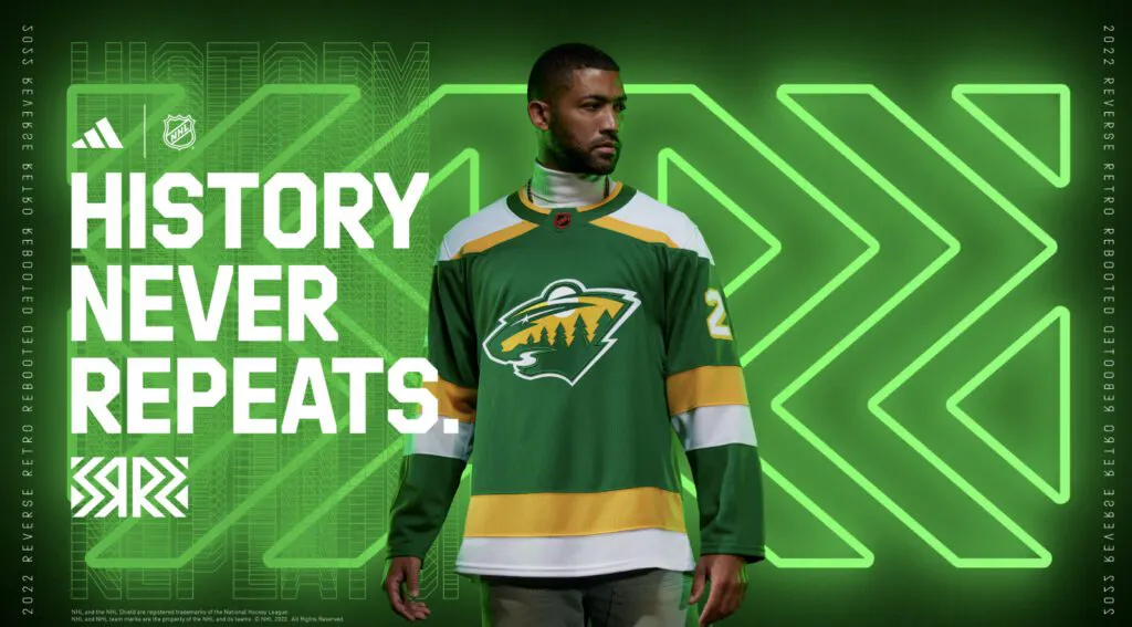
The Wild took the popular 2021 design and swapped the white for the green. It was popular then, and it’ll remain popular now, but essentially re-doing their previous design somewhat kills the creativity.
21. Winnipeg Jets
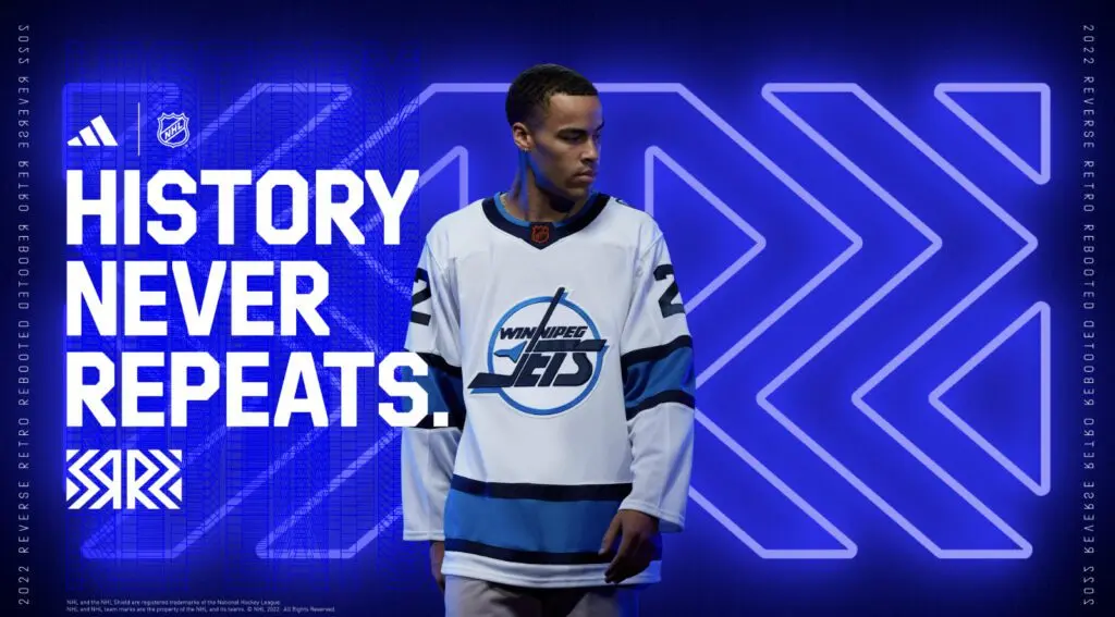
Maybe one day, we can get acknowledgment of the Atlanta Thrashers. But that won’t be today. This isn’t as bold as the previous Reverse Retro, but the logo looks nice and should be a hit with fans.
22. Toronto Maple Leafs
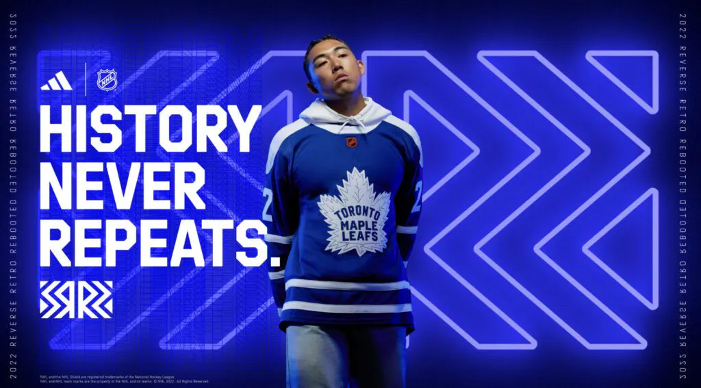
Early leaks suggested it would look more like the alternate the team wore during the Mats Sundin era. The design is simple, but the white shoulders feel a bit distracting. It’s OK, but nothing special.
23. Seattle Kraken
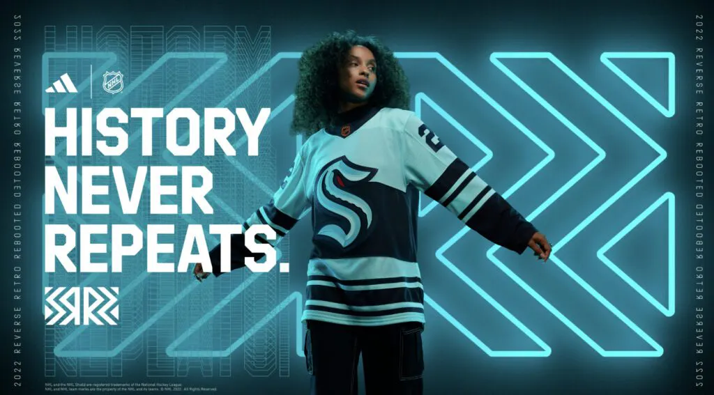
Given the Kraken weren’t even around the last time the NHL went the RR route – a whole two seasons ago – there isn’t much the team could have done. It would have been awesome to integrate an actual Kraken a bit more here and do something completely 1990s and crazy, but they instead went with a few stripes. Maybe the team’s goalies will get some matching pads or something.
24. Carolina Hurricanes
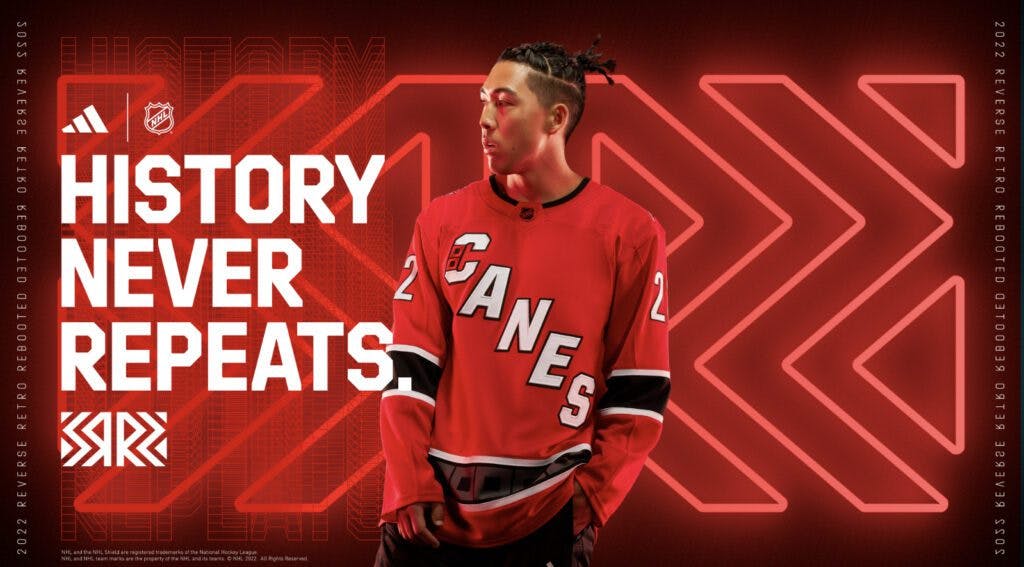
The design itself is OK, but one has to wonder how much better they’d be with the usual Hurricanes logo. The “Canes” nickname just doesn’t work here. Hard to screw up the color scheme, though.
25. Dallas Stars
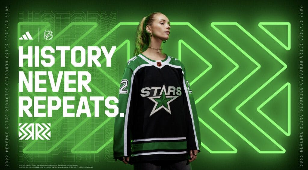
Does this give value store knockoff vibes to anyone else? The logo looks good – 3Dish, almost – but the greyish stripes feel a bit cheap on an otherwise solid color palette.
26. Ottawa Senators
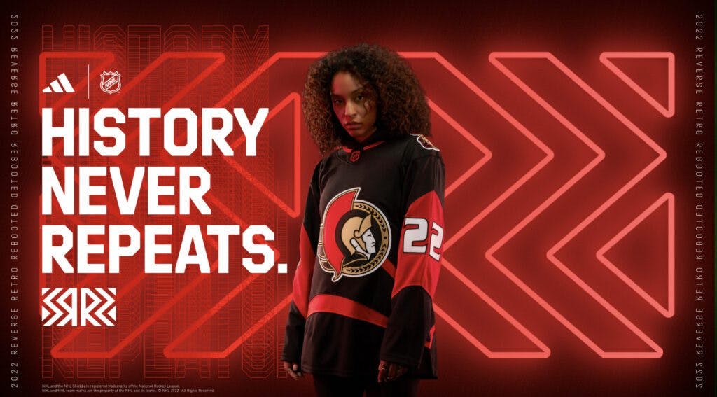
This is a throwback to the uniform they wore during their 2007 Stanley Cup run, but it feels like they could have done a bit more with the black section at the bottom of the logo. Maybe a bit more white or something to make the half-red arms look less out of place.
27. Chicago Blackhawks
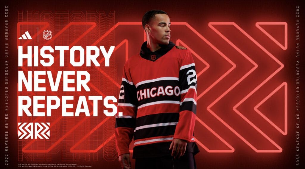
This is just a less-polished version of what the Detroit Red Wings did. The stripes also make it look more like a Ralph Lauren polo. This would have stood out a bit more if Detroit had not had a similar design.
28. Philadelphia Flyers
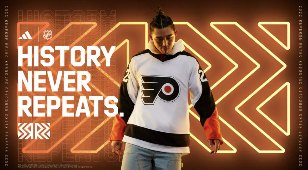
OK, ignore the jersey for a second. The Cooperalls are back! The jersey is pretty bland, removing most of the color that makes Philadelphia’s usual uniforms pop so well. But the Cooperalls are back for pre-game warmups. That’s awesome.
29. Arizona Coyotes
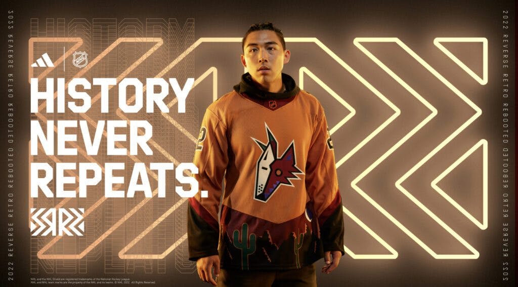
You know what? It’s different. OK! The burnt orange isn’t great, but the inclusion of the cactuses at the bottom is nice. But the primary color just doesn’t feel right here.
30. Tampa Bay Lightning
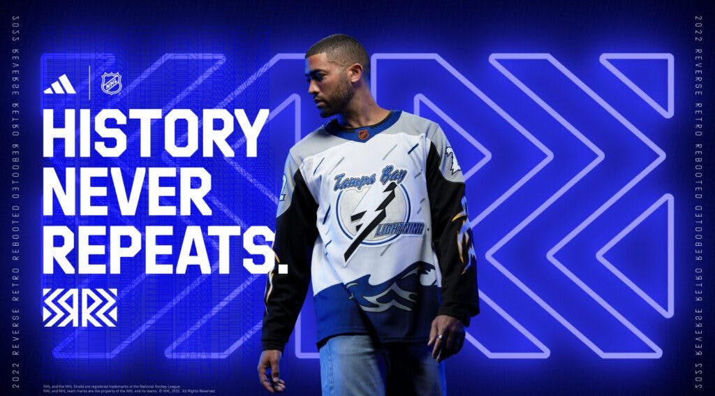
Nostalgia for the sake of nostalgia can be a bad thing. Tampa has had some very hit-or-miss designs in the past, but it really didn’t need to bring this back. The one thing that can really save these is if either Andrei Vasilevskiy or Brian Elliott plays into it and wears some retro-inspired gear. Otherwise, this could have stayed dead.
31. Calgary Flames
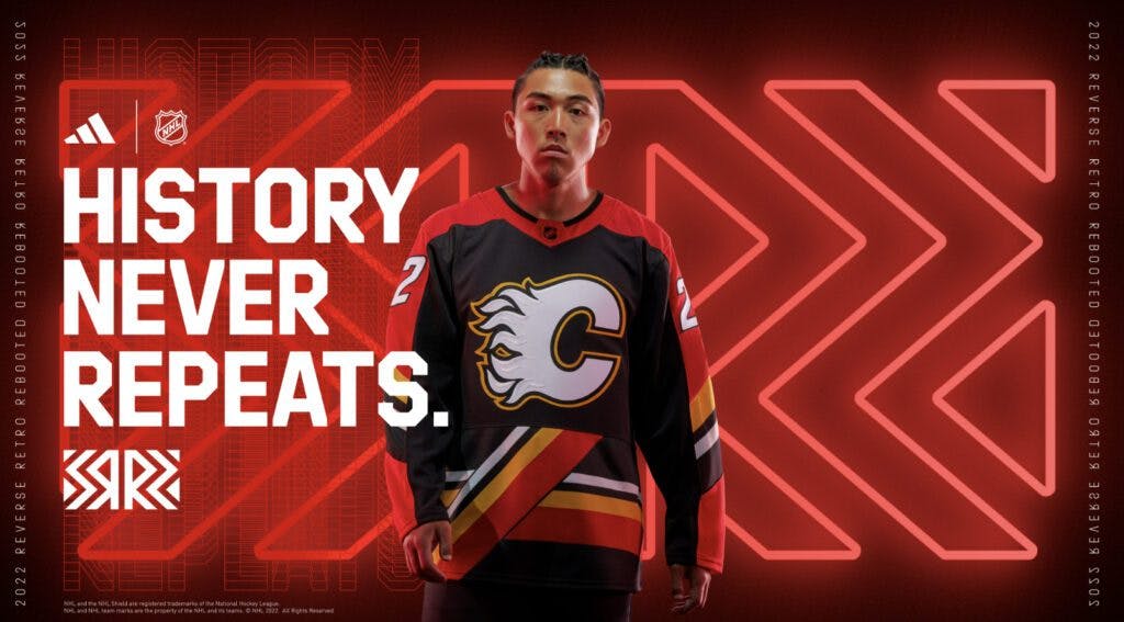
The Flames knocked it out of the park with their 2021 retros, but this just feels like gobblygook. The diagonal stripes were dumb the first time they used them and, SURPRISE, it’s dumb now. The logo kind of looks nice on the black background, but for a team with an outstanding color scheme, this sucks.
32. Columbus Blue Jackets
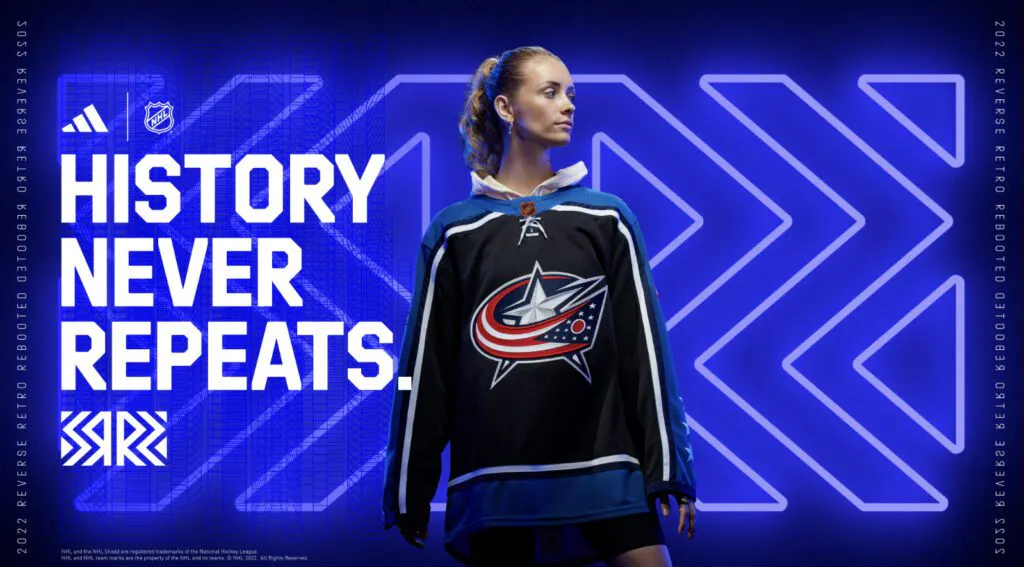
The team was going for a revival of the club’s original third uniforms but decided to make the torso black for some reason. Given they have never incorporated black into the uniform in any meaningful way, this decision makes no sense and definitely doesn’t work. No, just no.
_____
POINTSBET IS LIVE IN ONTARIO. PLAY NOW!

Think you know sports? PointsBet Canada is live in Ontario!