Ranking each PWHL team’s new jerseys for 2024-25


After learning each team’s new identities earlier this year, the six PWHL franchises have some new drip for their second season.
On Thursday, in partnership with Bauer, the league revealed new jerseys for the Boston Fleet, Minnesota Frost, Montreal Victoire, New York Sirens, Ottawa Charge and Toronto Sceptres. The new sweaters extenuate the new brands each team has been given for the 2024-25 campaign, featuring added colors and new logos.
Hunter Crowther and Tyler Kuehl give their rankings on the new jerseys that will debut later this month:
1. Toronto Sceptres

A jersey that fits every look.
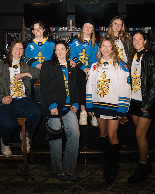


Hunter: 1st
Tyler: 2nd
Hunter: Playing in a city where every team has some sort of blue (apologies to the Raptors), the Sceptres needed to stand out with their uniforms, and that’s exactly what they’ve done. Reminiscent of the old St. Louis Blues sweaters, the Sceptres look to have perfected that combination of royal blue and gold, with their unique T-S logo centering an ocean of color.
These are the crown jewels of the league and will be seen worn by pedestrians walking downtown Toronto for years to come.
Tyler: I swear the people at Toronto Metropolitan University are kicking themselves for not thinking of something like this. The Sceptres’ sweaters are awesome. The added yellow/gold trim to the already recognizable rich blue blends together perfectly. Keeping a blue-based jersey fits in with the city of Toronto, but the powerful golden crest sets the team apart from the rest in the hockey mecca of the world.
2. Victoire de Montreal (Montreal Victoire)
À domicile At home

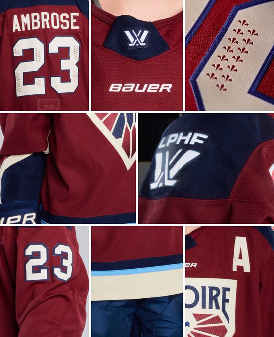
À l’étranger Away

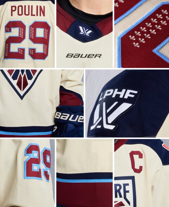
Hunter: 3rd
Tyler: 1st
Tyler: I was a huge fan of the logo, and I already like the color palette they had in their inaugural season, so these jerseys (as the kids say) are fire. The big crest gives the team a notably bold presence. I’m also a sucker for the cream color that became a staple in their road sweaters last year, so keeping that in tune with the “phoenix” logo looks very sharp.
Hunter: Maroon, the color that everyone forgets, then goes, “Oh yeah, that is nice.” Unapologetically local, the Quebecois fleur-de-lis centers a beautiful logo with a deep color scheme flattered with blue trim around the waist.
What really stands out within the six teams is that their away sweaters are cream-colored, instead of the standard white, and holy boats, they look too sweet. Most white hockey uniforms are uninspiring, but Montreal nailed it with these.
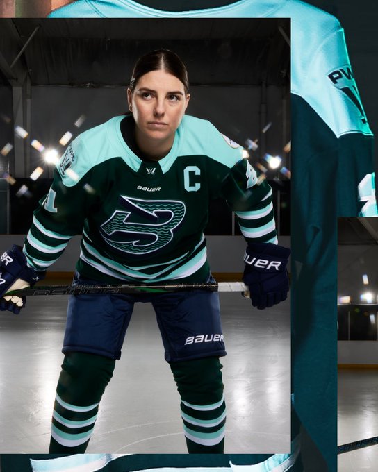
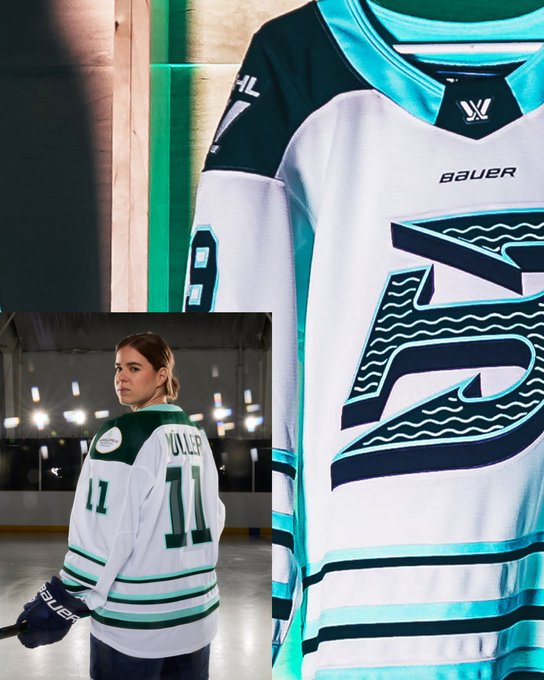
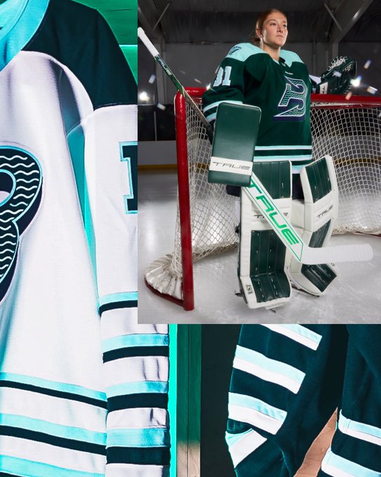
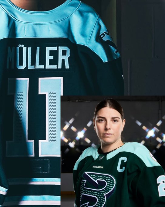
3. New York Sirens
Jerseys that never sleep. Early access to official replica jerseys available exclusively at shop.thepwhl.com


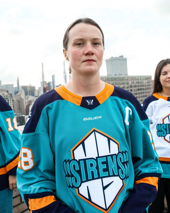
Hunter: 2nd
Tyler: 6th
Tyler: I don’t know what it is, but I’m not a fan of the “California Golden Seals” sort of feel. It also looks a little weird how the ssSIRENSss almost tails off underneath the arms, kind of erasing part of the crest. The Liberty Green in the logo also blends in a little too much with the home jerseys.
Doesn’t it also feel like, if the trim was more of an orange than yellow, they would’ve been better off going with the New York Islanders “Fisherman” design?
Hunter: The Sirens are giving ‘90s NHL expansion-era vibes with their teal and yellow-orange trim. The exterior vibrations of S-I-R-E-N-S on the front of the sweater remind me of different iterations of the iconic CBC logo, which should be familiar to any hockey fan of a certain age.
I’ll be honest, I just love this color scheme so much that the very standard logo design doesn’t register on my radar. I wish more teams went with funky fresh colors like the Sirens, and it’s my hope they stand in a city filled with some of sport’s most iconic franchises.
4. Boston Fleet
New season, new style 💥 Early access to official replica jerseys available exclusively at shop.thepwhl.com
Hunter: 4th
Tyler: 4th
Tyler: Look at that! One that Hunter and I both agree on.
I was a fan of the green right off the hop, with the reverse trident giving a little love to the old Hartford Whalers. The teal on the shoulders and trim give the jersey more of a seaside feel, which is clearly what the designers were going for. Obviously, they couldn’t go with a teal-based away jersey cause that would mash with the Sirens’ sweaters, but white with the green secondary color looks cool, too.
Hunter: There’s a theme of locality with every team’s uniforms, and the Fleet’s mixture of various greens with a logo inspired by the now-defunct Hartford Whalers really hammers home that this is New England.
The stripe design on the arms and waist, combined with the light tint along the shoulders, left me saying, “Those are crisp” out loud when I first saw them, both their home and away threads. They may end up looking the nicest when worn during a game.
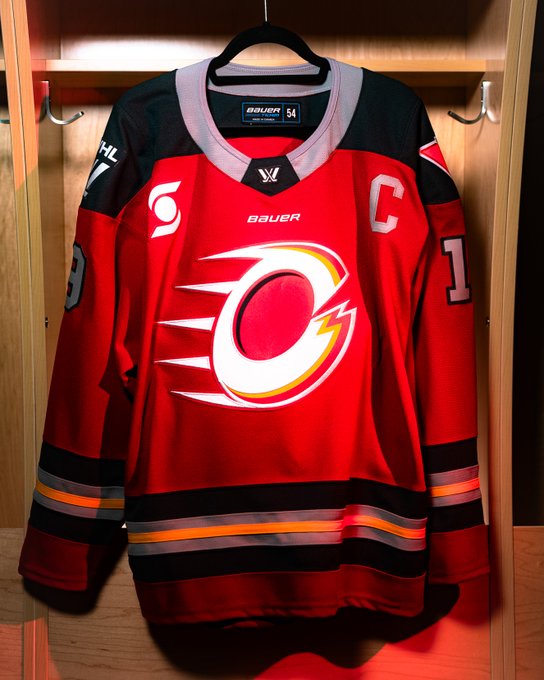
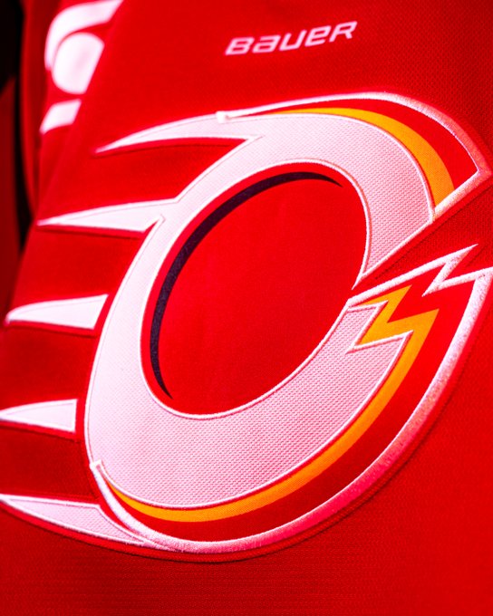
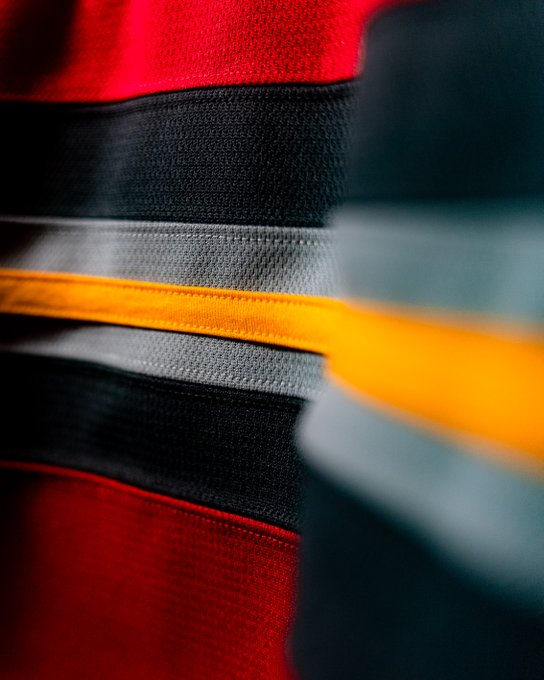
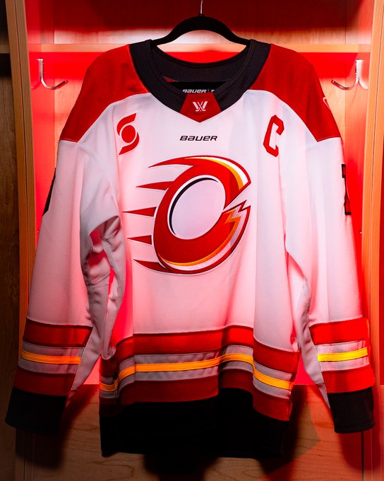
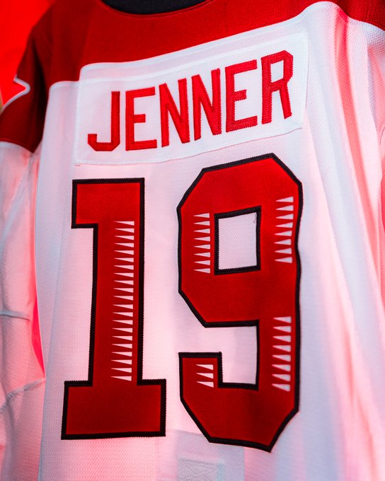
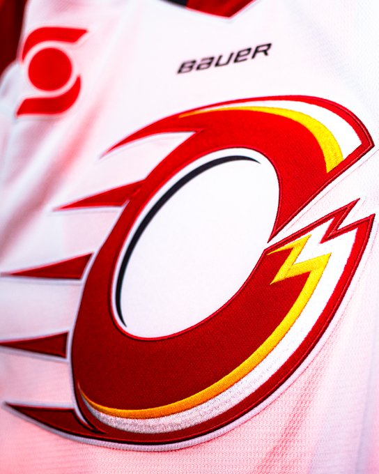
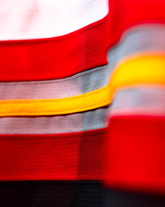
5. Ottawa Charge
Ready to Charge up our home ice in red again ❤️

Road whites looking electric! 🤍⚡️
Hunter: 6th
Tyler: 3th
Hunter: Perhaps the least unique of the group, maybe because they feel like the lovechild of the Ottawa Senators, Calgary Flames and Cleveland Cavalliers. However, just like the Victoire, their white jerseys stand out a bit more, with the red/silver/gold trip around the waist. They also feel like the sweater that best incorporates their sponsor patch.
Tyler: Hunter’s just a hater. The Charge’s jerseys look cool. They still have the bright red with gray shoulders that Prime Minister Justin Trudeau rocked last year. The added yellow gives the team a little more energy, even if it looks like a particular NHL team from Alberta. No one’s going to be laughing at them when they hit the ice this season.
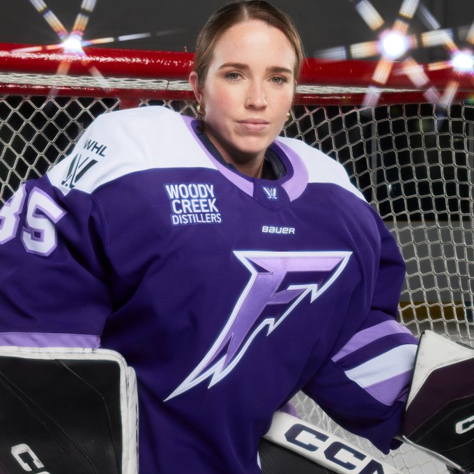
6. Minnesota Frost
Ready to hit the ice. Be one of the first to secure our official replica jerseys. Early access available exclusively at shop.thepwhl.com


Hunter: 5th
Tyler: 5th
Hunter: The color purple is synonymous with the state of Minnesota, largely due to the NFL’s Vikings and the iconic artist Prince. And while I love the grape jelly and earlybird purple selection, at first glance I felt a bit underwhelmed. The logo place feels so non-symmetrical that it’s distracting when you first see it.
Who knows, maybe like the Fleet, they’ll look so good during gameplay that it won’t matter.
Tyler: I will admit, the way the ‘F’ looks slightly different on the home and away jerseys looks pretty cool. However, they seem to be the most simple of the bunch. The shades of purple follow suit with the rest of the teams in the PWHL, but to Hunter’s point, the team is good enough that people will forget how average these designs are.
The second PWHL season is set to begin on Saturday, Nov. 30, with the Sceptres hosting the Fleet, and the Victoire facing off with the Charge. The Sirens and Frost will begin their new campaigns on Sunday, Dec. 3.