Team Canada Hockey’s best and worst uniforms of all-time


On Wednesday, I took a look back at the good, the bad, and the ugly when it came to Team USA hockey uniforms. Next up, Team Canada.
Before we get into that, here’s what Canada is going to be rocking in Beijing in 2022. Just like with the United States, fans are, uh, not happy about this look. The big issue seems to be with how Nike is pushing so hard to make black a part of Canada’s look even though it isn’t at all in the flag.
The 🍁 is ready for another iconic moment 🤩 Here are the hockey jerseys that #TeamCanada will be wearing as they compete for Olympic 🥇 at Beijing 2022 ➡️ bit.ly/3FG2b43 📸: Hockey Canada
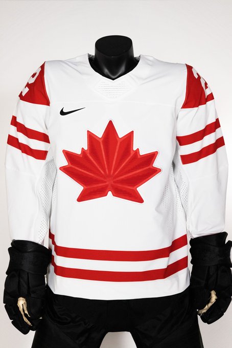
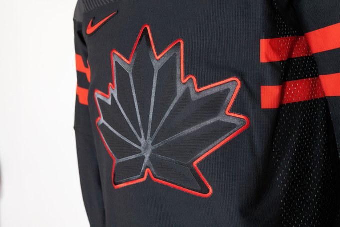
Personally, I don’t disagree. I think a black Team Canada jersey can look quite good (I loved the alternates in Sochi, though I’m in the minority there) but going for red and black doesn’t make much sense. Canada’s red jerseys would look very sharp if they had a white logo, name, number, and stripe.
Anyways! Let’s take a look at some other strange experiments that Canada has tried out…
THE BAD ONES
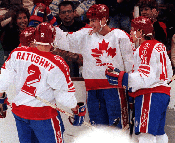
I’m going to get this monstrosity from the 1992 Olympics in Albertville, France out of the way first.
Now, in all honesty, this isn’t a bad-looking uniform in a lot of ways. The color scheme is quite nice, the red really pops out, and the three-dimensional numbers on the back look really cool.
The problem is that these don’t look Canadian at all. No, Canada isn’t known for the red, white, and blue, that’s a different country. Also, the Canada logo on the chest looks like that of a gas station on the side of a highway.
Make the pants red, fix up the logo, and we could have a gorgeous uniform here.
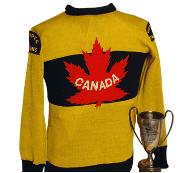
I might catch some heat for this because these mustard containers are certainly viewed as an iconic look for Canada. The Winnipeg Falcons wore them in Antwerp, Belgium at the 1920 Summer Olympics, which also served as the first World Hockey Championship.
There’s one thing to really like about this jersey, which is the gorgeous, artsy rendition of the Canadian flag serving as the logo. But the issue, of course, is the horrendous mustard yellow, which looked even worse when Nike dropped a remake for the World Cup in 2004.
Okay, back to the 90s we go.
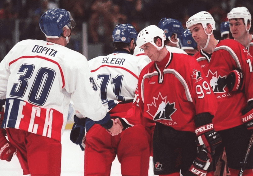
At the Nagano, Japan Olympics in 1998, Canada made the pivot away from their Petro-Can logo to the modern logo with the player skating the middle of the maple leaf.
It’s a great logo, but, unfortunately, the rest of the uniform leaves a lot to be desired. What’s going on with that silver stripe? Almost seems like a self-fulfilling prophecy that the team isn’t going to win gold, right?
This is one of Canada’s all-time bad looks because it’s the everlasting image we have of Wayne Gretzky sitting on the bench and watching the team lose in the shootout in his one and only go at the Olympics as a player in his career.
THE GOOD ONES
Okay, now that we’re through the few strange and ugly ones, we can enjoy some of the absolute gems that Canada has brought to the ice. There are quite a few so I had to leave some of them off of the list, unfortunately.
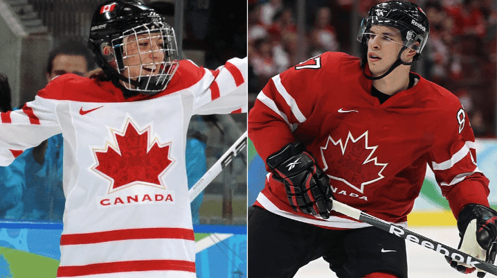
A nice, clean look and good memories? That’s what’s going on with these gems from the 2021 Olympics in Vancouver.
The men’s and women’s teams both captured gold that winter, capping an incredible ride that saw Canada dominate the podium on home soil (and, well, ice and snow).
These are great uniforms, top to bottom. They’re clean and simple, capture the red and white of Canada’s flag, and the aboriginal artwork embedded in the maple leaf gives it an extra touch of beauty.
I’m glad that we get to watch The Golden Goal over and over in these things.
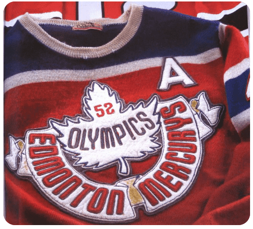
Now, I’m going to contradict myself here. I was whining about Canada using blue in their gas station uniforms in 1992, but the fit that the Edmonton Mercurys wore in 1952 is simply gorgeous, even though it heavily features a color that doesn’t represent the country.
Nothing beats this logo. It’s just a thing of beauty. Canada won gold in these beauties in Helsinki, Finland in 1952, their last win in Olympic men’s hockey until 2002 in Salt Lake City.
Finally, we have a pair of iconic looks. I can’t decide which of these two is better, so I’m just going to present them both.
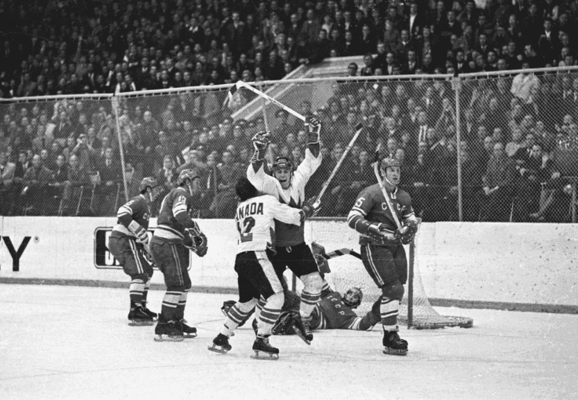
Canada’s most iconic team naturally wore Canada’s most iconic jersey. And, above, you have arguably Canada’s most iconic photo.
The 1972 Summit Series featured Canada’s version of The Dream Team. Canada beat the Soviet Union in an eight-game, best-on-best series with the likes of Ken Dryden, Tony and Phil Esposito, Bobby Clarke, and many more.
The simplicity of these jerseys is perfect. It’s a big flag on the front with no lettering and the nameplates on the back all say Canada. Perfect.
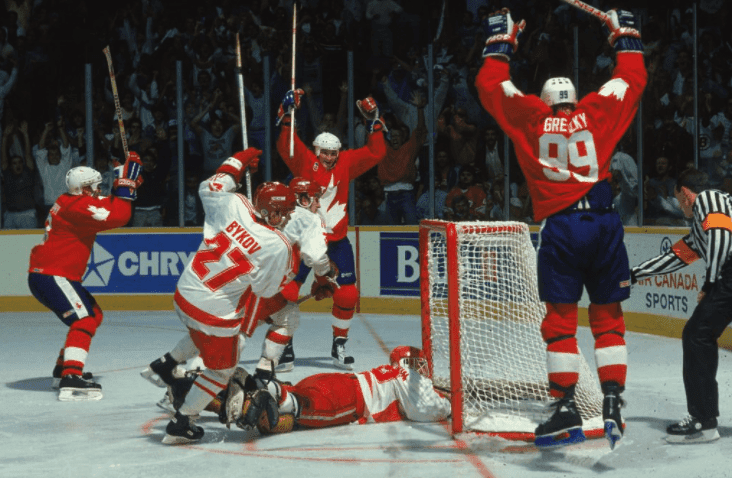
And then there’s this look from the 1987 Canada Cup, which also featured some incredible names. This tournament was especially memorable because fans got to see Wayne Gretzky and Mario Lemieux play together on not just the same team, but the same line.
Like the 72 uniforms, the ones from 87 rock because of the simplicity, intense color red, and that big maple leaf that takes up the majority of the jersey. Red and white! That’s what works!!!