Rankings the NHL’s Reverse Retro Jerseys


The NHL revealed all 31 of their Adidas Reverse Retro jerseys on Monday. Some are great and some are tragic. So let’s have some fun and rank them from 1-to-31.
I’m not just ranking them based on how they look but also taking into consideration what each team had at their disposal. If you had great retro jerseys and went another direction, that’s a huge L.
According to Stephen When of the Associated Press, these jerseys will go on sale on December 1st. More importantly, the NHL told by league and players this morning they’re still focused on January 1 start date for the 2021 NHL season.
Let’s start the rankings with the worst Reverse Retro jersey:
31. Detroit Red Wings
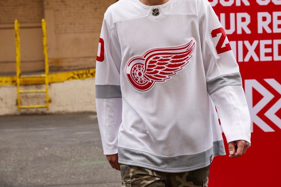
I’m a Red Wings fan and this is just pathetic. It looks like a practice jersey. They really threw the logo onto a blank canvas and added three grey stripes?
You’re telling me they couldn’t have at least taken this and “reversed” the colour scheme? Come on. Last place for not even trying.
30. Chicago Blackhawks
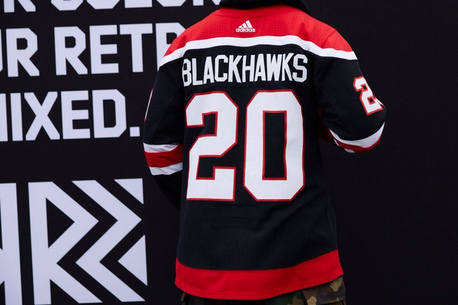
Could be a beautiful jersey for all I know. The problem is I don’t know because they just showed us the back. Might as well change your name to the Chicago Hockey Team now and just leave the front blank.
29. Winnipeg Jets
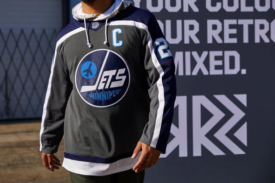
The Jets are lucky that the Red Wings didn’t even hand in their homework and Chicago forgot to put a logo on their jersey because these are bad.
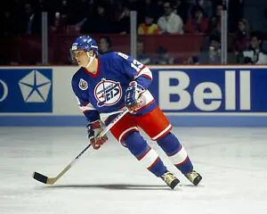
Not taking the light blue Teemu Selanne era jersey and making it red is a huge missed opportunity.
28. Toronto Maple Leafs
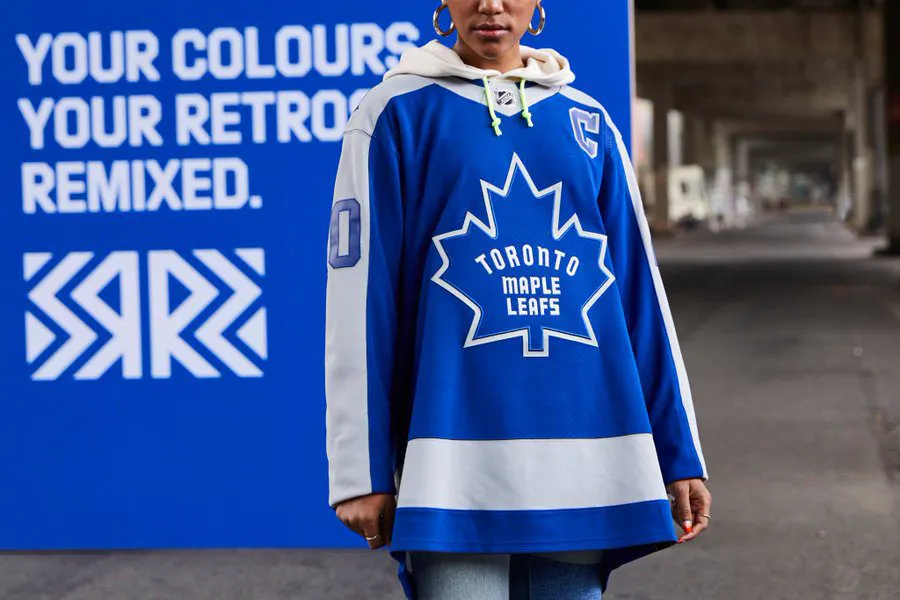
First of all, it looks like a poncho. Secondly, it’s just boring. Original 6 teams rarely step outside of their comfort zone and get creative. Looks like a Maple Leafs jersey you’d find at Canadian Tire.
27. Dallas Stars
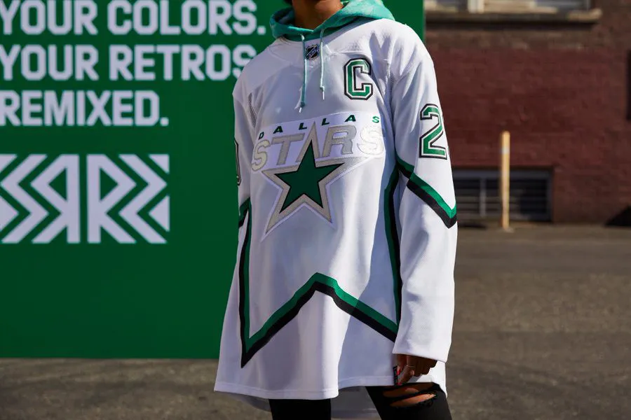
I don’t know what the thought process here was. First, the Monster Energy jerseys a few weeks ago now this garbage? The Stars need a new design team. Oh, and rumour has it they’ll be rocking white pants and white gloves with these 🗑
26. Anaheim Ducks
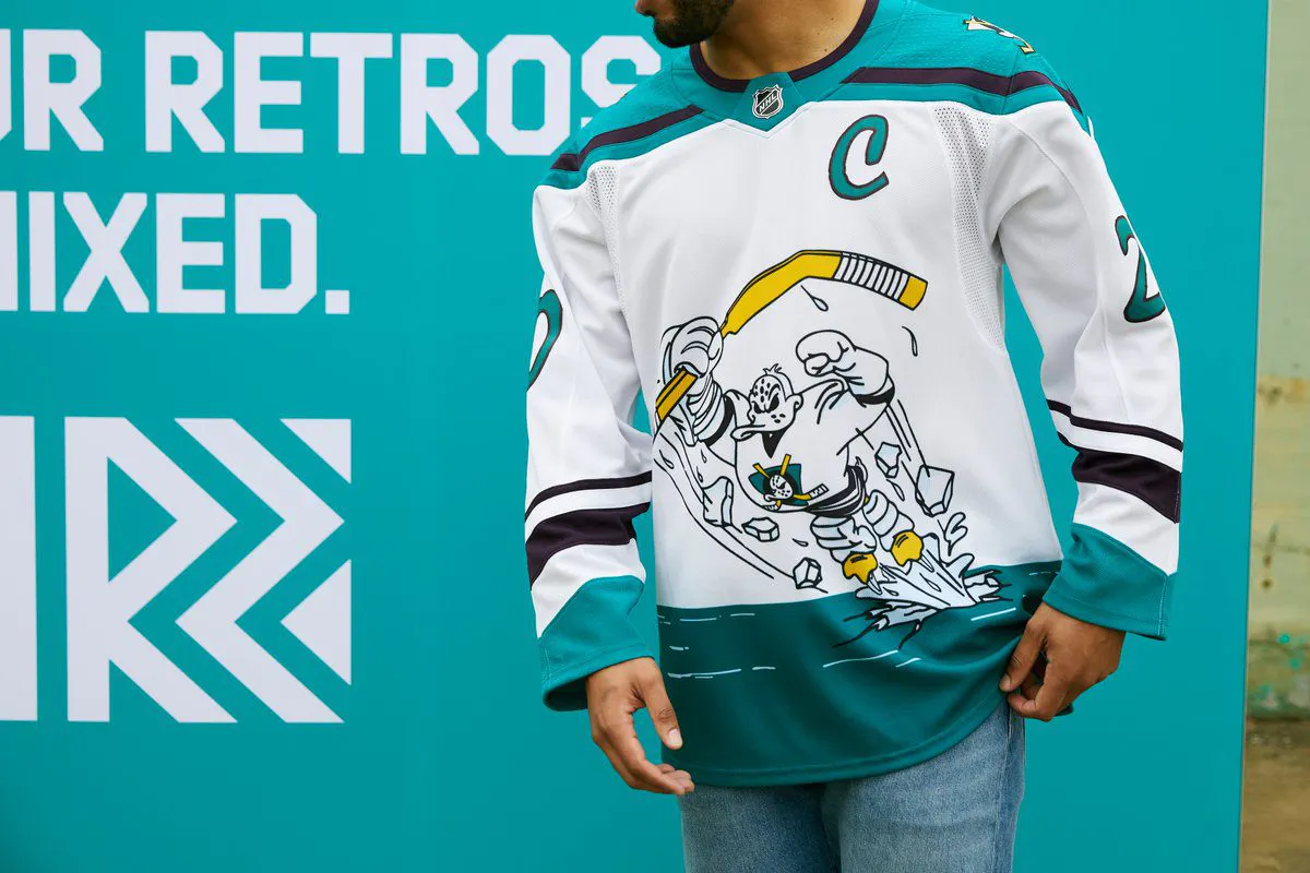
This was easy. Walk into the dressing room like Jan in D2 Mighty Ducks with the classic Mighty Ducks throwback. Instead, they did whatever this is.
25. Vancouver Canucks
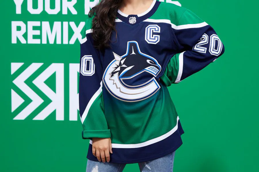
You’re telling me that you have one of the most beloved retro jerseys in hockey and you did your best Seattle Kraken impression? The jersey itself isn’t the worst but this is a glaring missed opportunity.
24. San Jose Sharks
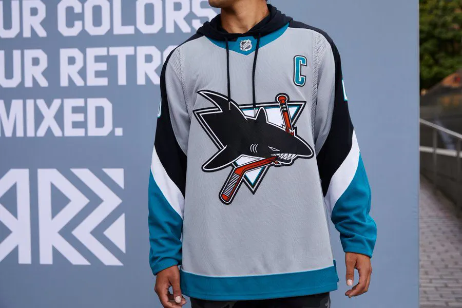
The Sharks only had a couple of retro jerseys to pick from and they went with the worst one. Their original teals were great, these are well below average.
23. Ottawa Senators
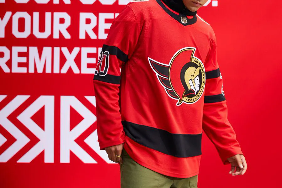
The Senators didn’t have many choices here. They’re already going back to their 2-D look full-time this season, so they made it red. It washes the logo out too much and just doesn’t look nearly as crisp as their blacks.
22. Columbus Blue Jackets
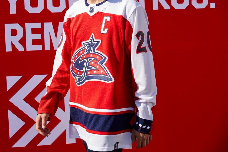
Columbus is another team with limited choices. It’s the reverse of their jerseys from their inaugural season in 2000 but they literally look like the Washington Capitals.
21. New York Islanders
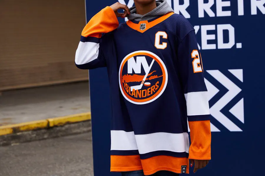
It’s a nice jersey but there isn’t much reverse or retro about it. It’s pretty much what they wear now. A teal-ish nod to Zigmund Palffy would have been preferred.
20. St. Louis Blues
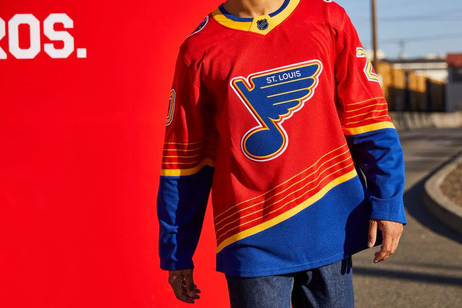
This is the definition of a reversed retro but it just didn’t land. The original blues were beautiful and the red doesn’t do it any justice. Probably would have looked better yellow.
19. Philadelphia Flyers
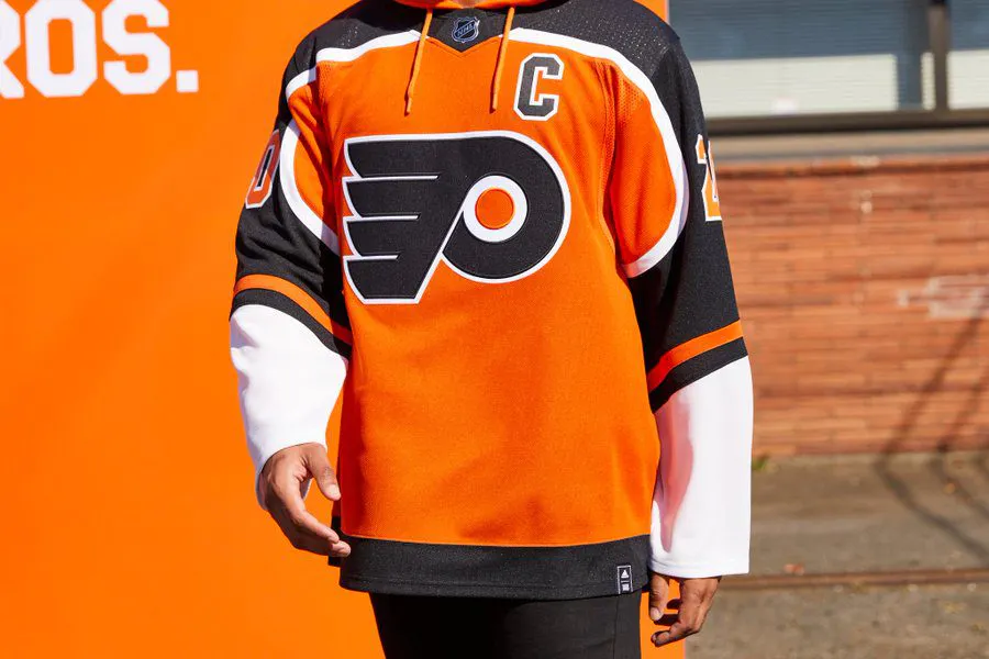
The Flyers have seemingly been rocking the same sweater for over 50 years and not much changed here. They look more like a Walmart knock-off of their originals but it’s still a sharp sweater. A black, late-90s Eric Lindros, John Leclair look would have been better.
18. Vegas Golden Knights
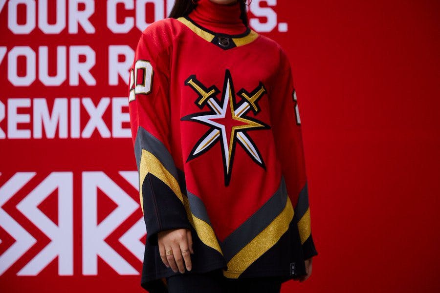
I’m not sure how the Vegas Golden Knights have a retro sweater but it’s pretty nice. It was only a matter of time before we got a Red sweater from Vegas and they did a solid job. The logo is a little too Buffalo Sabres for me though.
17. Nashville Predators
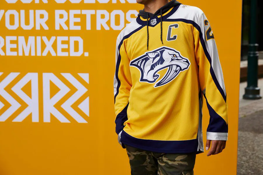
Pretty much what they wear now but nicer. Upgrading their jersey deserves a decent grade but they’re still just average. I get a Steve Sullivan, David Legwand vibe from them so they hit the retro feel.
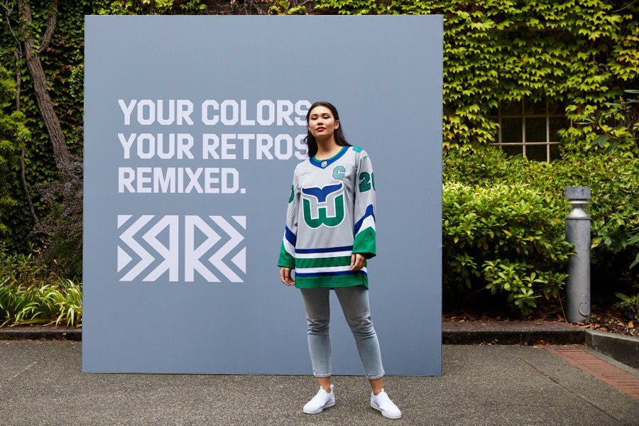
16. Buffalo Sabres
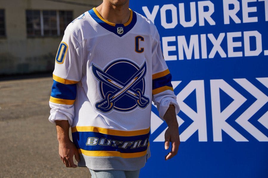
These are fine. The Sabres have one of the cleanest colour schemes in all of hockey, so it’s hard to make their jerseys look bad. However, I would have loved to see them bring back the Dominik Hasek era goat head logo.
15. Montreal Canadiens
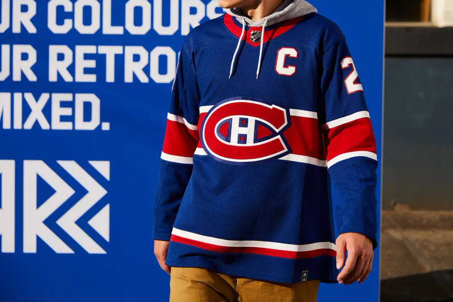
Another Original 6 team that doesn’t stray too far from the beaten path. We’ve seen a blue jersey from the Canadiens in the past but this is definitely their best one yet. It’s a clean look but doesn’t ‘wow’ you.
14. Calgary Flames
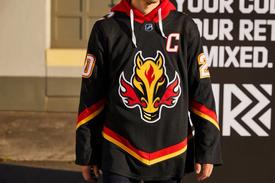
It turns out that this horse is named “Blasty.” I was unaware prior to the unavailing of this jersey. It’s a fine jersey and a fine logo that pays homage to the Calgary Stampede but it’s a little too gimmicky.
13. New York Rangers
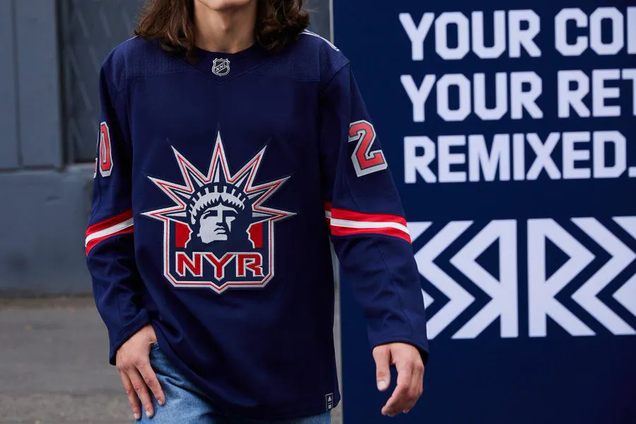
I wanted to rank these higher because bringing back Lady Liberty was a great call but they’re just a little too boring compared to the one Wayne Gretzky wore for me to get fully behind them.
12. Pittsburgh Penguins
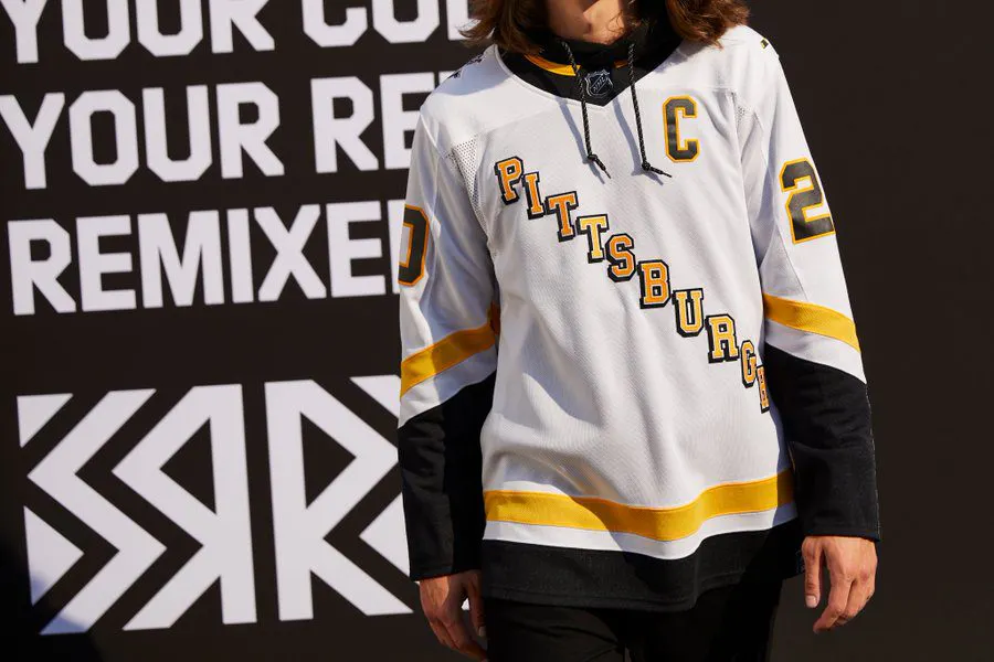
This is a strong throwback look. It’s extremely simple but it makes you think Mario Lemieux and Snoop Dogg at the same time. Name another jersey that can do that.
11. Tampa Bay Lightning
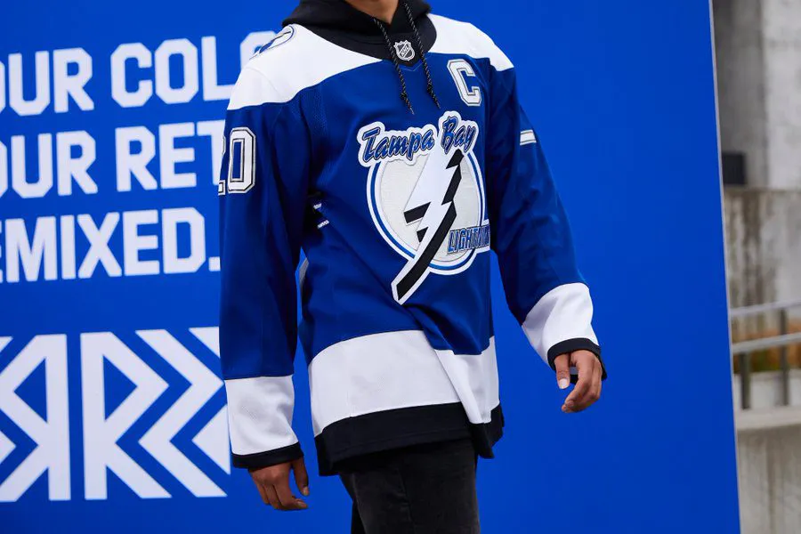
Vincent Lecavalier and Dave Andreychuk will love these. This is another complete “reverse” of a retro jersey and the timing couldn’t be better. The Lightning won their first Stanley Cup in the jerseys that these pay homage to and they’ll be wearing them as they defend their second Stanley Cup.
10. New Jersey Devils
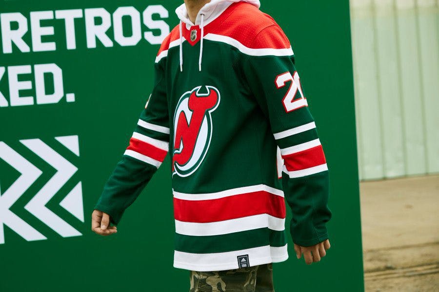
I’ve always been a huge fan of the New Jersey Devils’ green but somehow this feels like too much green. It’s still a great look but doesn’t live up to some of the other sweaters.
9. Boston Bruins
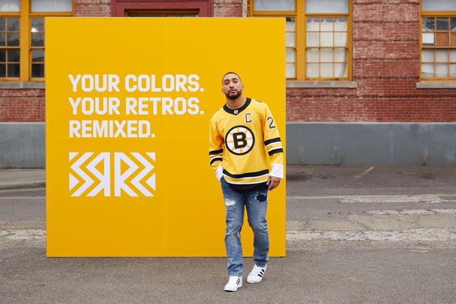
I feel like I’m higher on the Bruins’ than most but this is a gorgeous throwback. It’s been a while since we’ve seen the Bruins in a yellow sweater and there are some serious Bobby Orr vibes going on here.
8. Florida Panthers
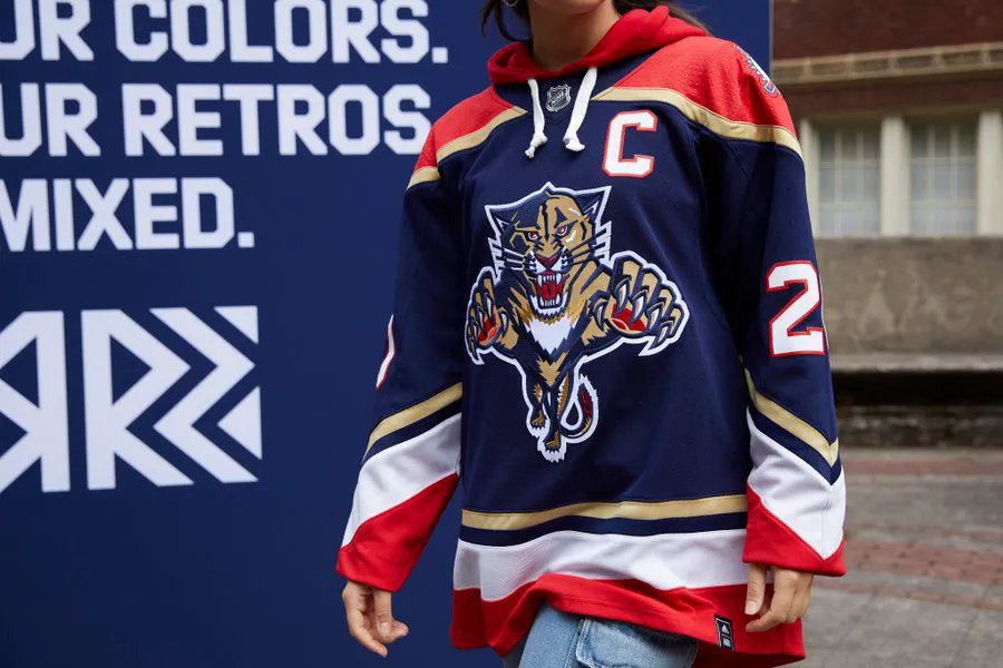
It’s an achievement for the Panthers to rank this high on any hockey list but they nailed it with this jersey. Going back to their original jersey and logo is a great look and hopefully, they get rid of the shield logo for good soon.
7. Washington Capitals
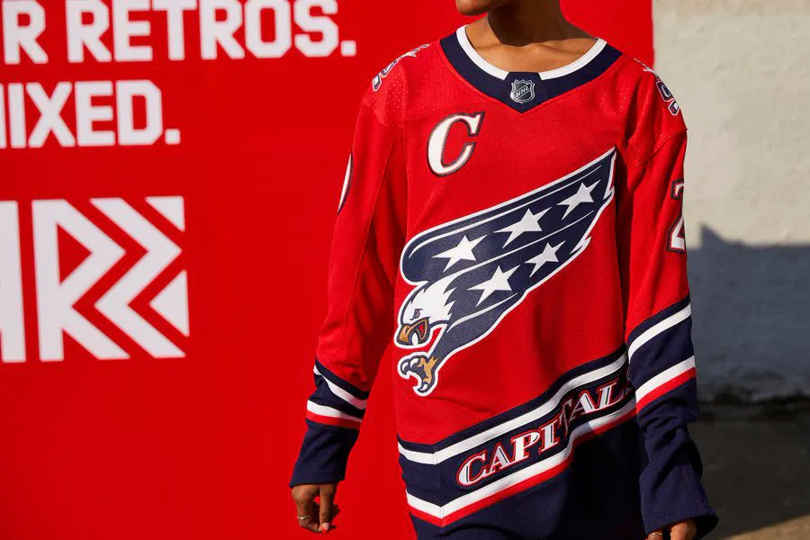
A throwback to 1998 when they went to the Stanley Cup Finals. The Capitals took an already sharp jersey and restored it with their current colour scheme and the result is outstanding.
6. Arizona Coyotes
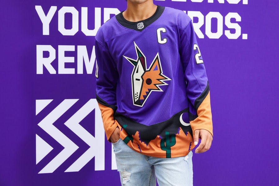
Fans are either going to love or hate the Coyotes’ jersey. There’s no way to be impartial to it. They already rock their famous Kachina jerseys fairly often, so they took their old alternate and changed it from green to purple and I’m about it. The desert landscape is a little too ECHL for me and that keeps it out of the top-5.
5. Edmonton Oilers
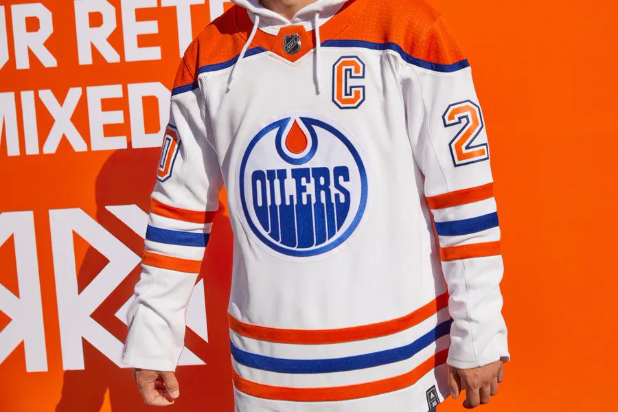
Some of the Oilers’ concepts leading up to this jersey reveal were horrendous. Luckily, the Oilers stuck with a proven look, updated with their fresh colours and the outcome is excellent.
4. Colorado Avalanche
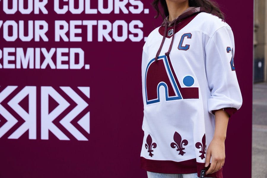
The Avalanche going back to the Quebec Nordiques automatically put them in the top-5. What kept them from No.1 was a lack of execution. This is a nice jersey but far from how amazing it could have been.
3. Carolina Hurricanes
I’m a sucker for the Hartford Whalers jersey. These are gorgeous, no way around it. Top-3 easily.
2. Minnesota Wild
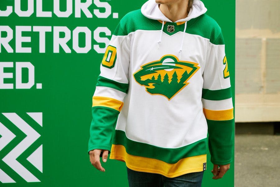
I wasn’t prepared for the Wild to have some of the best jerseys but these are terrific. Paying homage to the Minnesota North Stars with the colours and striping and mixed with their current branding produced an outstanding sweater.
1. Los Angeles Kings
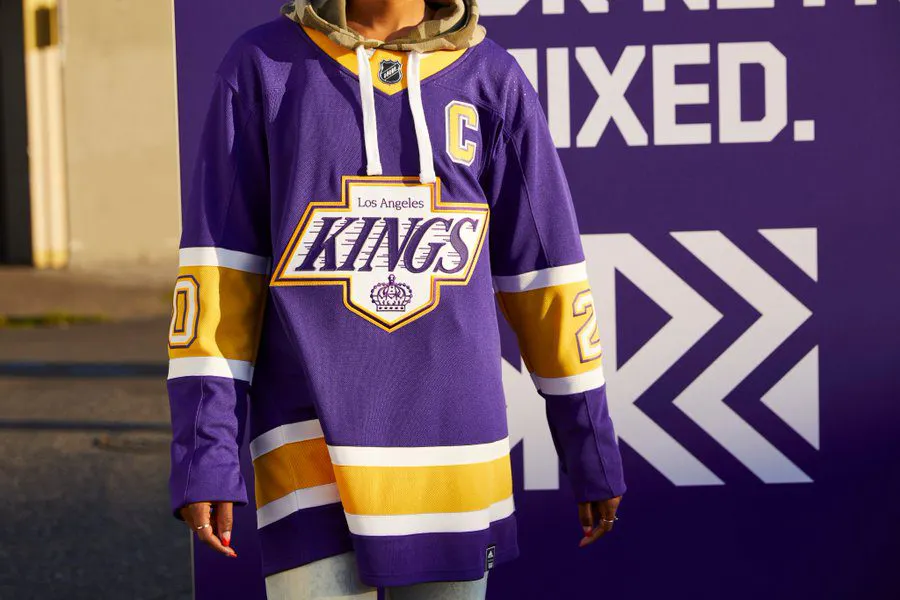
I mean what is not to like about these? It’s their classic black and grey jersey and logo updated with the throwback purple and gold. It’s the top Reverse Retro jersey in my mind.
Tell us which jerseys you like best by visiting our Instagram page and voting on all 31 jerseys!