Grading the four PWHL expansion team brands

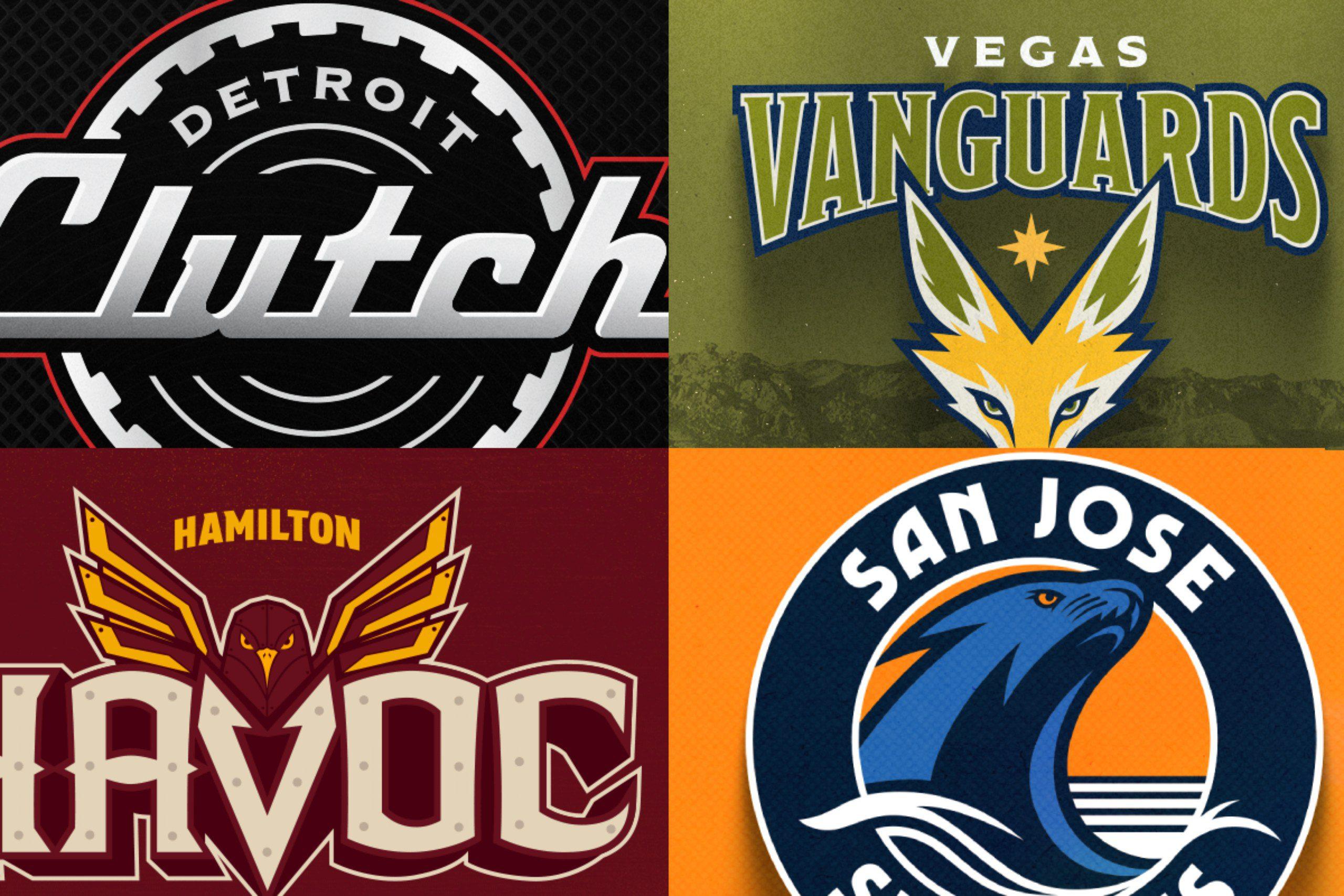
We know what the four newest teams in the Professional Women’s Hockey League look like; what do you think?
The league released the four brands of the expansion franchises set to drop the puck on the 2026-27 campaign, the PWHL’s fourth season. With that, it’s time to let opinions and hot takes run rampant. Today, I give my thoughts on logos and nicknames of the new teams on the block, and whether they’re perfect for the league, or if they’ll be made fun of by others around the game.
Detroit Clutch
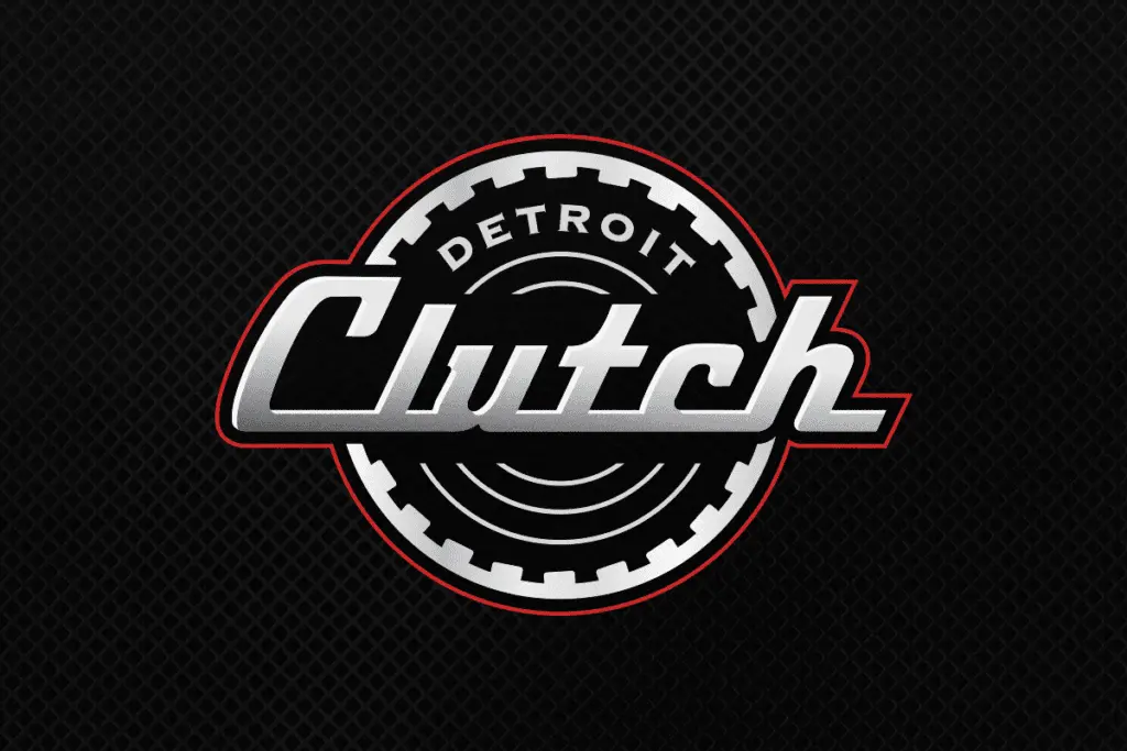
Tyler Kuehl (B-): I think the name itself is rather goofy. I looked back at what people thought when the Detroit Pistons were introduced. The logo itself isn’t all that bad, as I kind of like the black with a red tint, giving me some comfortable AC/DC vibes. The automotive signature is a nice touch, as the franchise is really buying into the Motor City reputation Hockeytown was originally built on. However, when it’s paired with the black jerseys the team will be playing with, it gives me amateur hockey vibes…not something you want to see in the best women’s hockey league in the world.
Hamilton Havoc
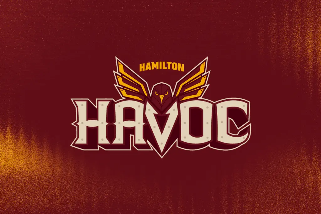
Tyler Kuehl (A-): I’m not going to lie, it’s been hard for me not to write “Huntsville Havoc” (shoutout to any SPHL fans out there). Yet, the logo is very strong in my eyes. I love the scowling falcon, and the font of “Havoc” fits very well with the rustic colors that are meant to represent Steeltown. Not to mention that it looks sharp…literally. I think the logo probably didn’t need the city name on it, but maybe that can be tweaked once they put them on the jerseys next season.
San Jose Sea Lions
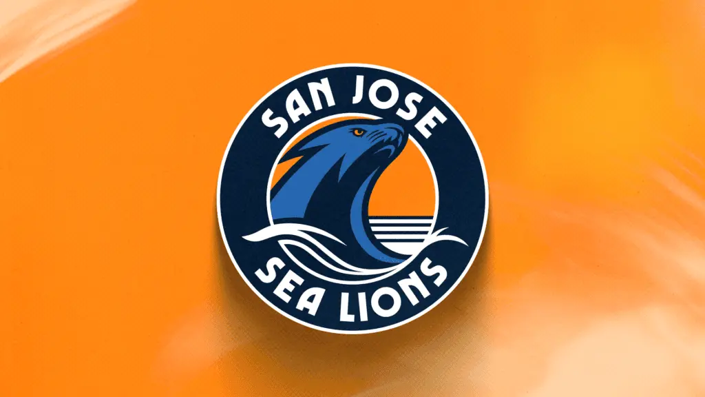
Tyler Kuehl (C-): Why didn’t they just call them the San Jose Sea World? Because, let’s be honest, the logo gives me a lot of theme park vibes, and the roster head coach and general manager Troy Ryan put together will be more torturous to watch than Blackfish. I’ve also been very hesitant about “circle logos,” as they seem to pigeonhole the image inside them. The colors might work…but the bright orange sweaters will make this team look more like a Beer League team than a professional hockey franchise. The only redeeming quality with branding is that, like other teams in the PWHL, the nickname is unique and connects with the market.
Vegas Vanguards
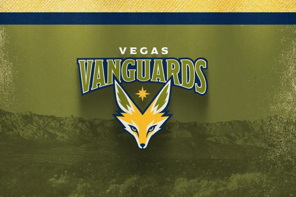
Tyler Kuehl (B): I honestly don’t know what to think about the Vanguards. As much as I despise alliterative nicknames, it works for Vegas. Trying to grasp “the great outdoors” around Sin City was certainly a strange play, but I’m starting to buy into the colors. Yet, the fox kind of brings down the mood. Nothing says fierce and menacing…like a fox? I understand there are native ties to the Mojave Desert, and it’s supposed to be “resilient in the face of adversity, but it’s kind of mediocre. Heck, even San Jose’s sea lion looks tougher.
One thing I will say, and it goes for Hamilton and Vegas, is that the names, as part of the overall brand, are nice, but they won’t put the whole thing on the jersey, right? I mean, Detroit and San Jose have the name incorporated into the logo, but if I see “Havoc” and “Vanguards” on a sweater in 2027-28, you’re going to be getting a whole different reaction story.

Cap Summary
Draft Picks

