Ranking all 23 third jerseys currently worn in the NHL

Earlier this month, the New York Rangers became the 23rd team in the National Hockey League to introduce an alternate jersey to be worn in the 2023–24 season.
The new uniform, dubbed the “New York City Nights” jersey, will be worn for the first of 10 times this year when the Rangers take on the Los Angeles Kings at Madison Square Garden on Sunday.
Third jerseys are hardly a new phenomenon in the NHL — their widespread usage dates back to the 1990s — and they’ve become even more widespread in recent years. With more than two-thirds of the league now deploying a full-time alternate uniform, we here at Daily Faceoff have decided to take on the responsibility of ranking them all.
While, for our purposes, full-fledged alternate jerseys introduced for the purpose of an anniversary or centennial celebration are fair game (looking at you, Boston and Anaheim), we’re not including any uniforms slated to be worn fewer than five times this season. It would go beyond the scope of this exercise to include every “special event” uniform, like the ones worn in outdoor games, or unique one-offs like the Jets’ RCAF Flyers threads or the Leafs’ St. Pats throwbacks. We’re sticking to the jerseys explicitly classified as “thirds” or “alternates.”
Also, it’s worth noting that we’re taking all aspects of a uniform into account in creating our rankings. Jerseys, pants, socks, helmets, you name it — it’s all fair game. That also includes any and all advertising patches, however discreet or obtrusive they may be.
I, Mike Gould, have been joined by two of my cherished Daily Faceoff colleagues, Scott Maxwell and Colton Davies, in taking on this project. The three of us separately ranked the alternate uniforms from No. 1 to 23 and, once the final scores were tabulated, added snippets of our thoughts underneath each listing.
Without much further ado, we’ll kick things off in southeastern Pennsylvania.
23. Philadelphia Flyers
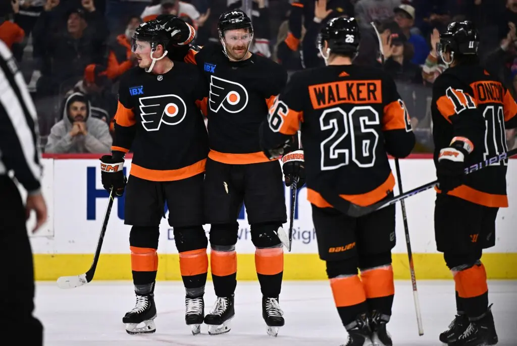
Mike: 23rd
Scott: 20th
Colton: 22nd
Mike: This uniform is a remnant from the 2017 Stadium Series, and boy does it ever feel like it. The names and numbers on this thing are huge — almost as though they were made to be seen from the upper deck of Heinz Field. The black logo on the black background isn’t everyone’s cup of tea, either. All in all, this design is pretty stale (and the blue ad patch doesn’t help). The Reebok era is long over, and with the Flyers having already redone their home and away uniforms last summer, it feels like a new alternate look is overdue as the league switches jersey suppliers from Adidas to Fanatics.
Scott: I will say that I like the reverse orange and black look, but yeah, the massive numbers feel jarring.
22. Washington Capitals
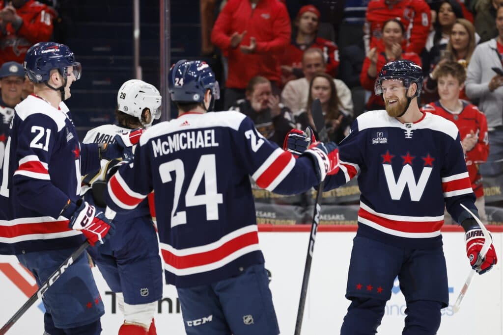
Mike: 16th
Scott: 22nd
Colton: 23rd
Scott: The greatest sin any hockey jersey can make is to use navy blue as the primary color, especially when the team itself does not have that color in its usual repertoire. The fact that the logo is just a big W on top of that makes this an uninteresting jersey.
Mike: I seem to like these a bit more than my fellow panelists. It’s a bit of a generic look, sure, but I kind of dig it on the whole (also, I’m pretty sure the Caps’ existing primary jerseys do have navy blue, Scott). That said, I think Washington would be served better by bringing back the blue, black, and bronze look of the late 90s as their alternate.
Scott: See, I hate the color so much that I just ignore it and only see the red!
21. Vegas Golden Knights

Mike: 22nd
Scott: 16th
Colton: 21st
Mike: In an effort to embrace the “Golden” aspect of their team name, the Knights have switched their sparkly gold jerseys over to primary status, meaning that their original grey jerseys have been relegated to alternate position. These were cool when they first dropped — again, all the way back in 2017 — but now, they feel like an afterthought. Grey never felt like a natural color for a Vegas team. Alternate uniforms are supposed to be special. What’s special about recycling an old home jersey? These barely count.
Scott: Bring back the red Reverse Retro jerseys!
20. Edmonton Oilers
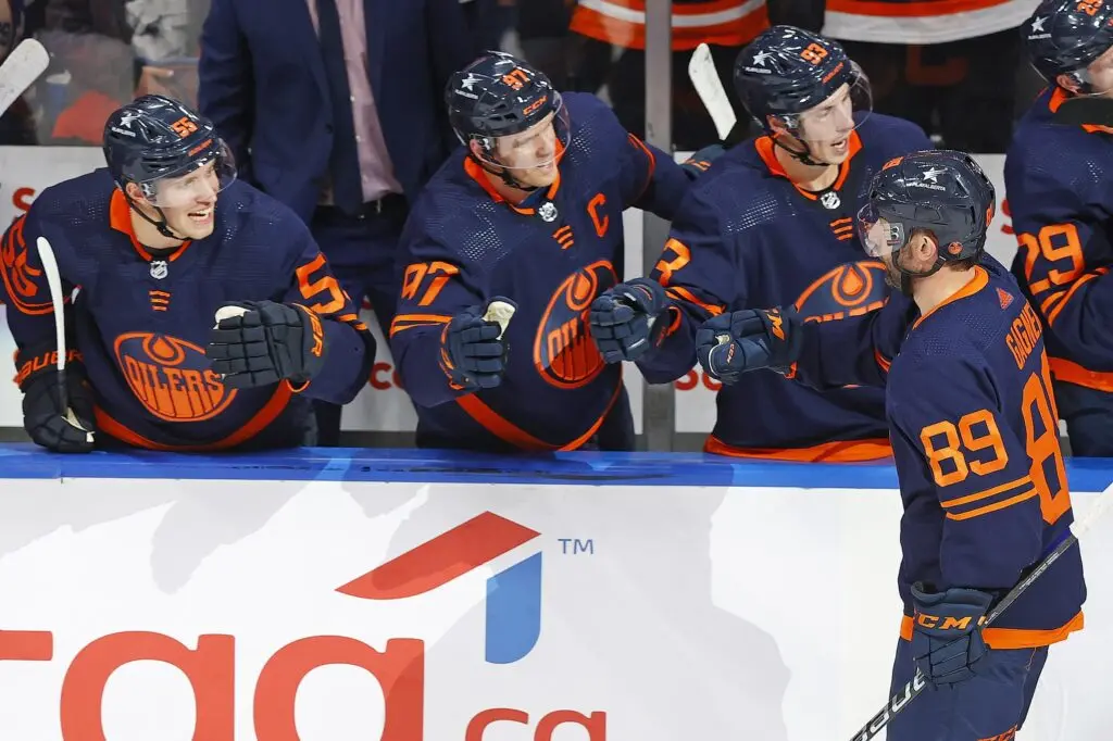
Mike: 20th
Scott: 23rd
Colton: 11th
Colton: I liked this jersey a lot more than Mike and Scott. Primarily due to the dark navy and orange look. I think for an alternate jersey it is sleek but keeps the originality of the Oilers. While I do agree the blue on their home jerseys is much better, I like the contrast the orange gives off, almost a neon style.
Scott: While I agree that the neon look looks cool, it just feels like the inverse of their equally terrible orange jerseys with the navy blue shoulders and I can’t ever be allowed to be reminded of those monstrosities.
Mike: Remember when they wore these in the playoffs? These are such a massive downgrade from the Oilers’ primary uniforms that it almost feels obligatory whenever they wear them now. Yes, they’re definitely better than those orange eyesores the Oilers used to wear, but those are long gone (thankfully). Looking ahead, I would love to see the Oilers reintroduce copper into their color palette for a future alternate.
19. New York Islanders
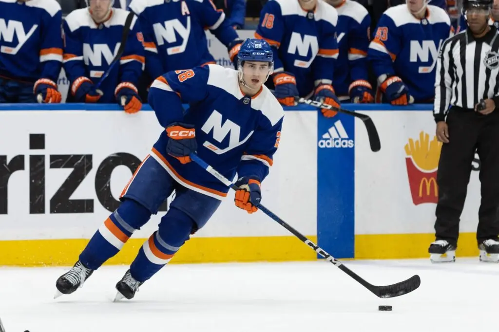
Mike: 15th
Scott: 19th
Colton: 19th
Mike: This is another look that has overstayed its welcome. This uniform draws its origins from the 2014 Stadium Series, when the Isles wore very similar threads — albeit with a tacky, chrome-ified logo — outdoors against the Rangers at Yankee Stadium. The simplified “NY” crest logo has been in use ever since, briefly adorning a monochromatic, Brooklyn Nets-like alternate before being put back on a blue base. Ultimately, the biggest sin this uniform commits is being too similar to the Islanders’ existing home jerseys. Want a more distinctive look? Bring back the Fisherman.
18. Pittsburgh Penguins
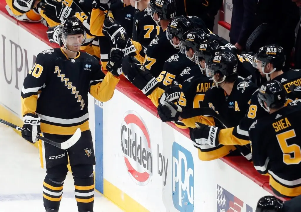
Mike: 18th
Scott: 13th
Colton: 20th
Scott: These things just feel vintage for me. When I see it, I think of Mario Lemieux and Jaromir Jagr, so it’s cool to see these brought back. They aren’t super creative admittedly, but it’s still a good look.
Mike: Meh. The Penguins have used more than a dozen alternate and special event jerseys during Sidney Crosby’s tenure, and this might just be the least memorable of them all. Even in the ‘90s, they were glaringly derivative and bland. Bring back the Robo-Penguin! The one with gradients and asymmetrical striping!
17. New Jersey Devils
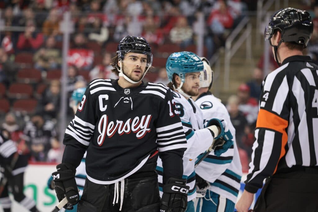
Mike: 9th
Scott: 21st
Colton: 18th
Colton: When these first dropped, they were unique. I liked the “jersey” font with the red outlining, and the white stripes along the top made the jersey really come together. But after seeing them in a few games, they felt awkward to watch on the ice. I think the Devils’ green jersey is a much better fit for an alternate.
Scott: Yeah, it just feels very lazy to me. The best part of this look was when MacKenzie Blackwood had the “Mask” mask to go with the “Jersey” jerseys. It hasn’t be topped since, so they may as well just retire them.
Mike: You guys are nuts. These aren’t lazy, they’re cool! Marty Brodeur designed them himself! They’re covered in drop shadows! They’re memeable! What’s not to like!?
Scott: You know what, this is the Martin Brodeur of jerseys, so fair. Whether you choose to take that statement as a compliment or an insult to his play is up to you.
16. Carolina Hurricanes
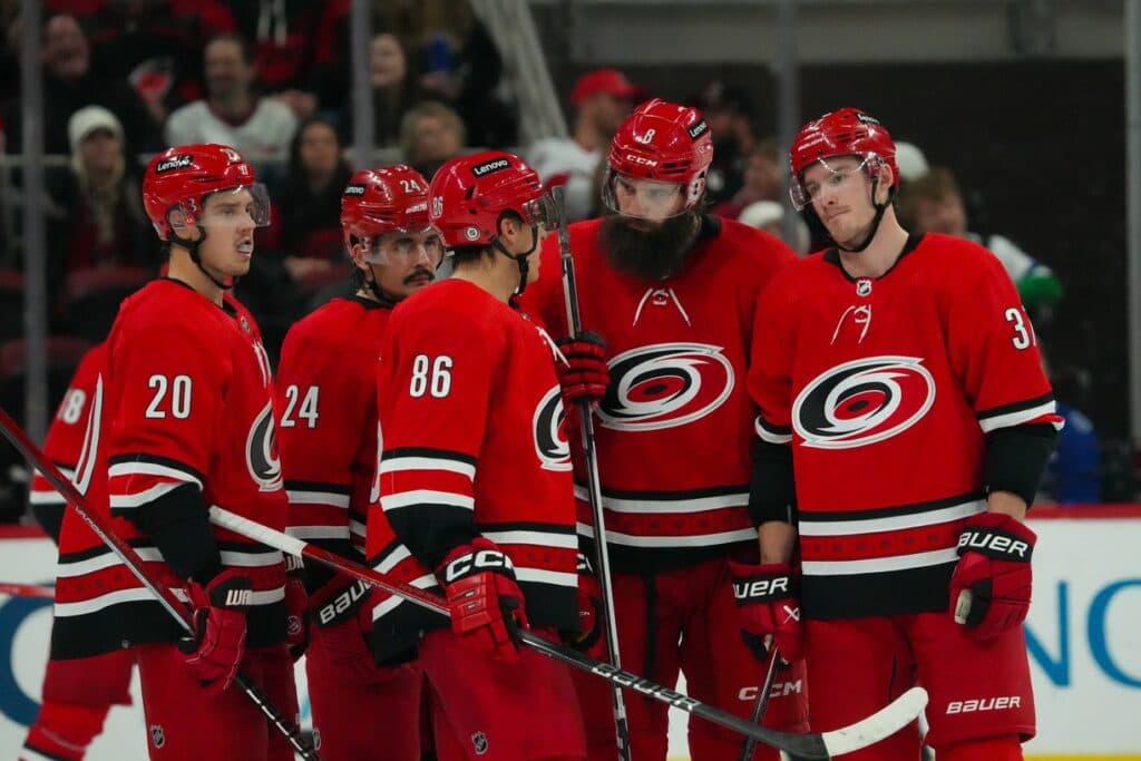
Mike: 21st
Scott: 7th
Colton: 17th
Mike: In isolation, these jerseys ain’t bad. They might be the best uniforms the Hurricanes currently wear. But … they lose points from me by being another repurposed home jersey, one that was awkwardly shunted into being an alternate in favor of the Canes’ black Warning Flag uniforms. On top of that, Carolina has a way better red jersey at their disposal, one that they already brought back last year in recognition of their 25th anniversary. I wouldn’t be surprised to see Carolina go back to using those 2006-era jerseys as their alternate after this year. If they do, they’ll be in my own top five.
15. Winnipeg Jets
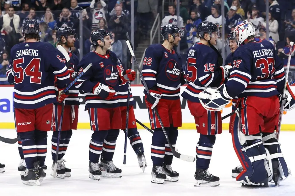
Mike: 14th
Scott: 17th
Colton: 12th
Scott: I already mentioned my disdain for the color navy blue, and the fact that the Jets could insult me by taking a classic jersey and giving it the most boring look possible has me split down the middle as to what I think about it.
Mike: I think these really suffer from a lack of contrast. The red numbers kind of fade against the navy blue base. I much preferred Winnipeg’s 2021 Reverse Retro look — the navy, grey, and white all really popped against each other. It was a color combo you don’t really see too much in this league.
14. Colorado Avalanche
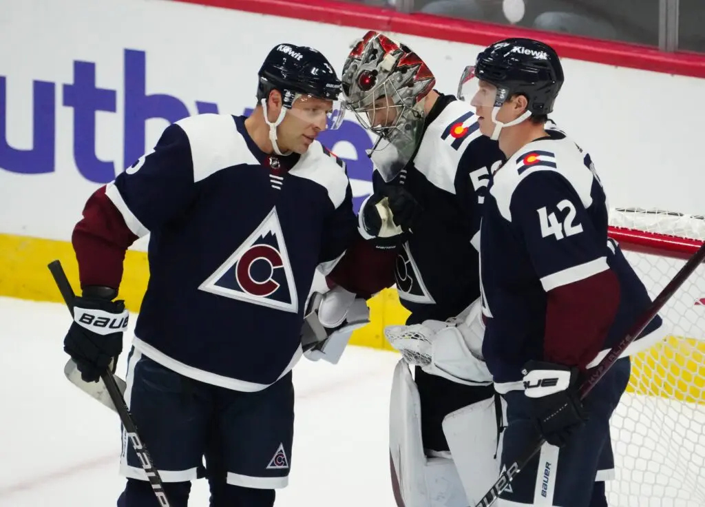
Mike: 13th
Scott: 15th
Colton: 14th
Colton: This jersey just screams “Colorado,” whether it be with the C in the logo, the Rocky Mountains in the background, or the colors. Then you have the shoulders which feature the snow-capped peaks of the Rockies. Overall, there is not a lot to dislike about the jersey, it just feels like Colorado recycles those colors a little too much.
Mike: This is another alternate jersey that has been around for a while. Funny enough, I actually think the Avs’ primary uniforms would look significantly better if they used navy blue instead of their current lighter shade. But these alts are thoroughly mediocre.
13. New York Rangers
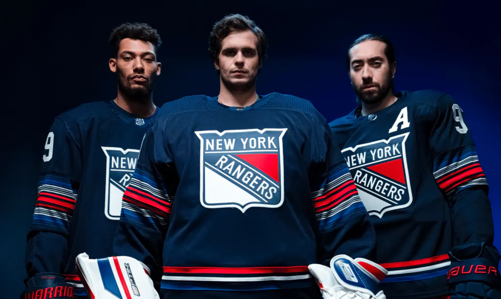
Mike: 6th
Scott: 18th
Colton: 15th
Mike: The league’s newest alternate uniform is also one of its best. I know some people don’t like how the Rangers’ shield logo looks on the front of a jersey — I saw about 15 variations of “it just doesn’t work as a crest” on Twitter in the hours after this jersey was first leaked — but I couldn’t disagree more. It’s big, bold, and very NYC. The intricate striping is super cool, too. I’m a sucker for jerseys with multiple shades of blue on them (it’s why I prefer the Blues’ current home uniforms to their alts). These new Rangers alts really deliver.
Scott: Again, navy blue will lose points in my books, and it in contrast to the shield just doesn’t do it for me, but I’ll give them some credit for actually using their logo on their jersey as opposed to just ‘RANGERS.’
12. Boston Bruins
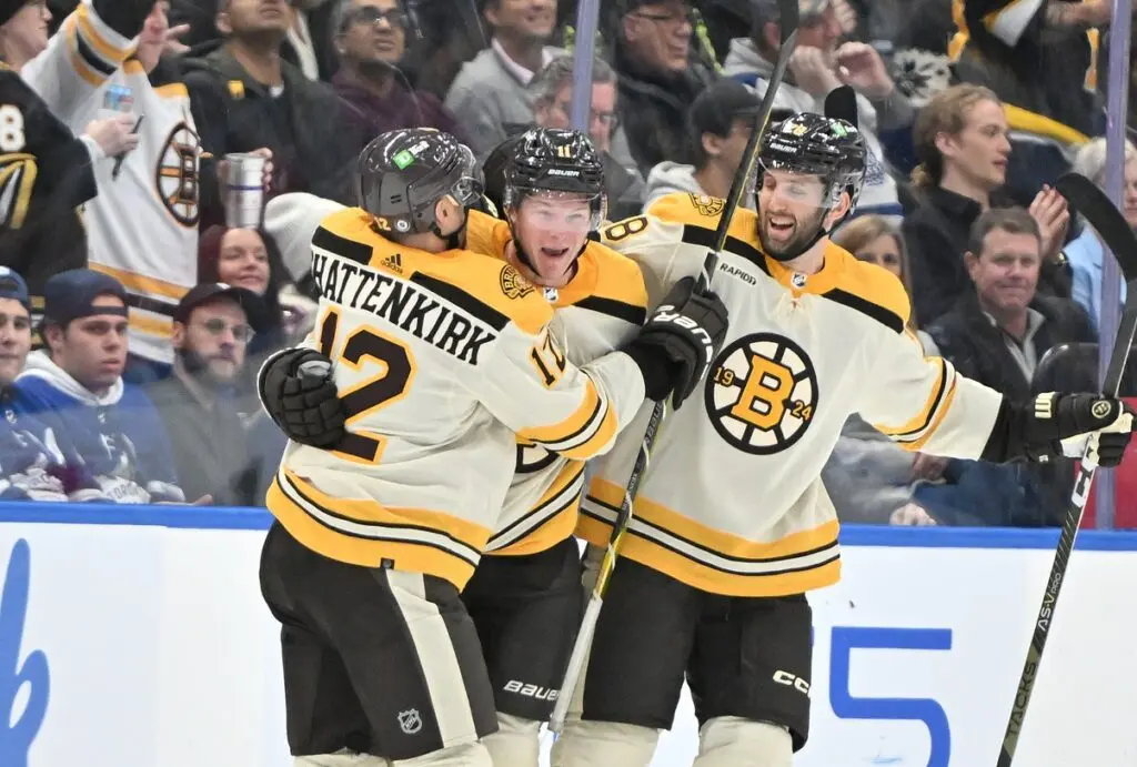
Mike: 17th
Scott: 5th
Colton: 16th
Scott: I clearly liked this jersey more than Mike and Colton, but I will preface this by clarifying that a big factor in my rankings is if the alternate jersey is better than their regular jerseys. This jersey has a nice, clean look to it, and it is also miles better than their regulars this year, which I’m not sure why they felt the need to change from their usual black and yellow jerseys. Yes, I know, 100-year anniversary, it still sucks.
Mike: I generally don’t love jerseys that use “vintage white” as a base color. It feels massively overplayed by now. Like Scott, I’m not really a fan of the home and road jerseys Boston switched to for their centennial — it feels like change for the sake of change. But I also don’t care for these alts much at all.
11. Los Angeles Kings
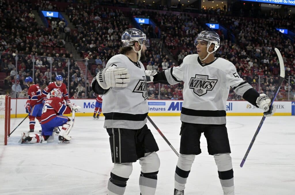
Mike: 19th
Scott: 3rd
Colton: 13th
Colton: The chrome helmets were a really cool addition to a throwback-style jersey. You got the old Kings logo, a nod back to the Gretzky-era late 1980s and early 1990s, and you team that up with the sleek chrome helmets and you’ve got yourself a look. Now the one gripe I have is there is just too much white and silver which really clashes with the rest of the uniform. Still, a cool throwback and the chrome helmets will always be awesome.
Scott: These old-school jerseys are my favourite Kings look, so the fact that they brought them back — along with the chrome helmets being a creative touch that you don’t often see in the league — made these an easy win for me.
Mike: I can’t stand the new fad of chrome helmets. They always look tacky. I feel like they might even be unfairly distracting to opposing teams. The jersey itself is good, but I can’t divorce it from those horrible shiny lids.
10. Columbus Blue Jackets
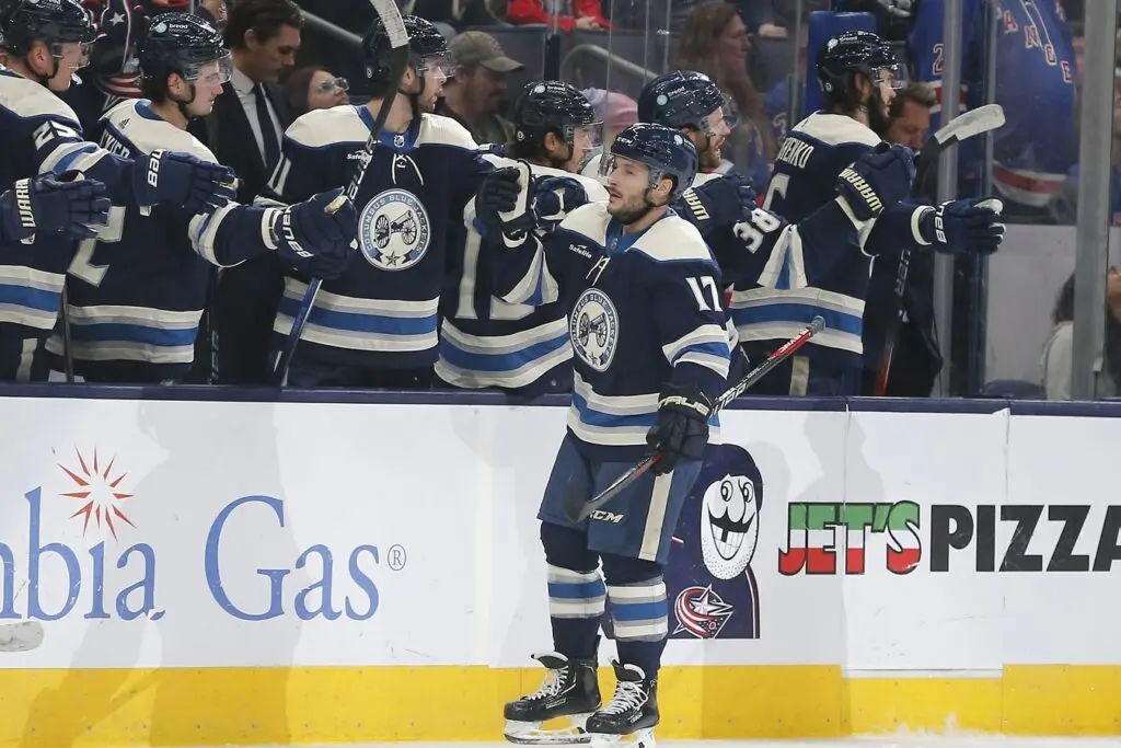
Mike: 7th
Scott: 14th
Colton: 10th
Mike: I’m actually surprised to be the highest on the Cannon jersey. It’s cool, but I’m starting to think it might be a tiny bit dated. I don’t love the off-white accents — they feel very much like a remnant from a bygone era — and the giant blue collar is a bit much. But this is pretty nitpicky stuff about a look that is immensely popular with fans for good reason. I just think it looked a bit better in the Reebok trim.
Scott: They remind me of the really weird alts that the Penguins and Panthers had in the late 2000s and early ’10s, although this style at least works with the Blue Jackets aesthetic.
9. Vancouver Canucks
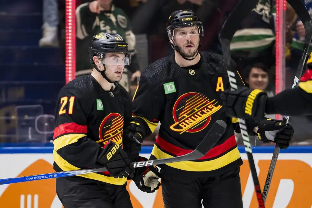
Mike: 10th
Scott: 10th
Colton: 7th
Scott: While navy blue will have me hating any look, I love a good black jersey with clashing colors. It’s a classic as well, and while I do like their blue and green jerseys more, this is such a nice look.
Mike: I hate the bright green TD patch on these. C’mon, Canucks, you couldn’t come up with something less obtrusive? I think I preferred the previous iteration of the Flying Skate jersey, but the updated version (introduced last year, with different striping and a more modern font) is similarly striking. Just get rid of that ad (or replace it with something less garish) and we’re good.
8. St. Louis Blues
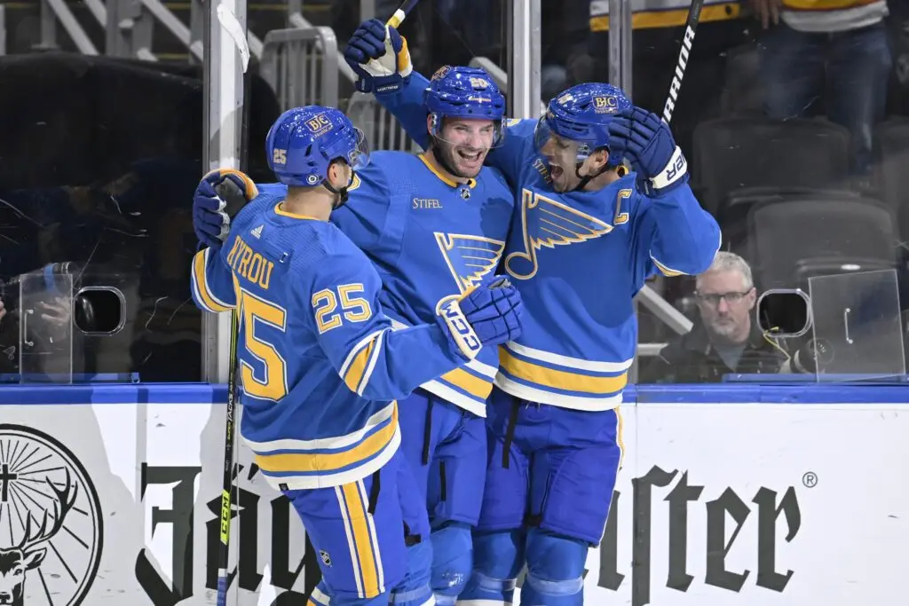
Mike: 12th
Scott: 6th
Colton: 6th
Colton: I love these jerseys. The baby blue and yellow is just a terrific look. It integrates old Blues style with next-gen flair and I think it’s a jersey and entire look they need to switch to full-time.
Scott: Agreed, the light blue is a much nicer and more classic look than their current jerseys.
Mike: No. I’ve always preferred the Blues’ current primary jerseys. I will die on this hill: Retro is not always better! The Blues won a championship in their current uniforms and looked damn good doing it. The two shades of blue complement each other beautifully. The powder blue alts are a little too one-note for my liking.
Scott: I’ll at least give you that I think their current homes are a significant improvement over their previous ones. Retro isn’t always better, but in this case it is.
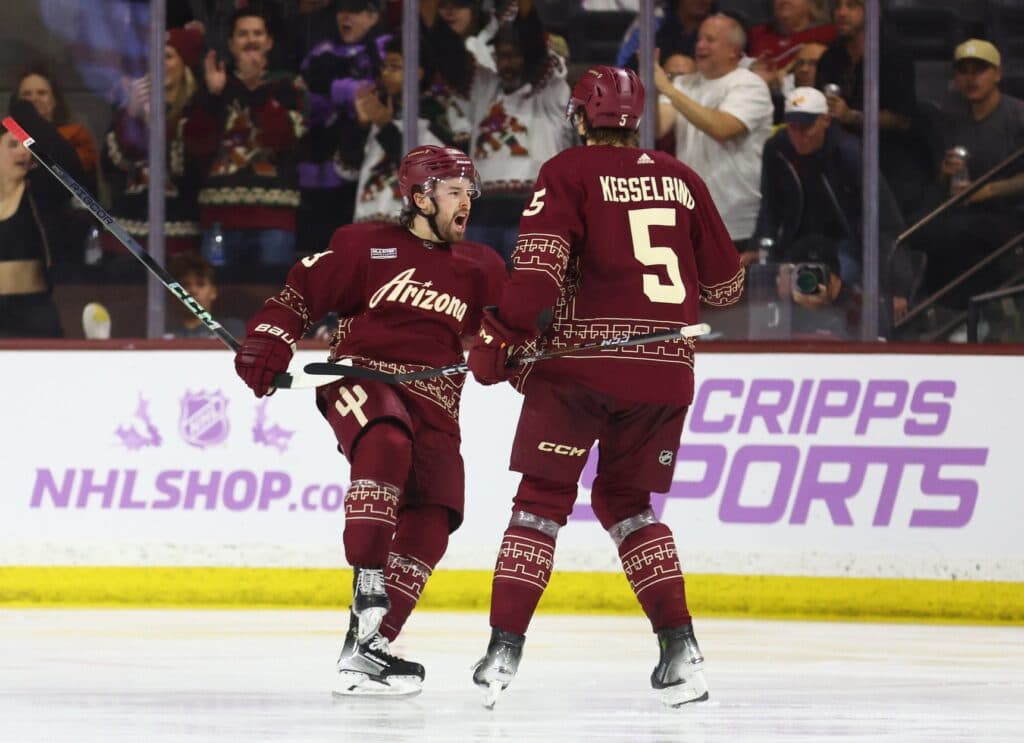
7. Arizona Coyotes
Mike: 2nd
Scott: 11th
Colton: 9th
Mike: The devil is in the details with this all-red look. A wordmark crest isn’t exactly the pinnacle of creativity, but take a closer look at the alternate captain’s patch and you’ll spot a couple of cacti leaning upon each other. Plus, there’s another big cactus on every player’s right hip. Add in the simplified waist striping from the Kachina jerseys and the matte helmets and you’ve got a winner. I genuinely like these more than the Coyotes’ primary home and road uniforms.
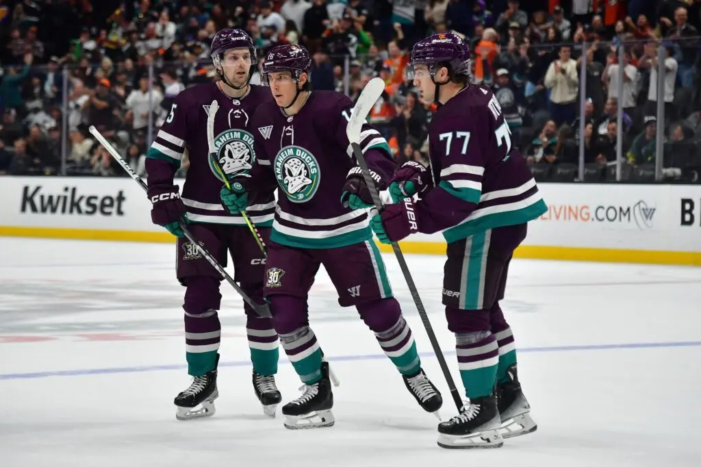
6. Anaheim Ducks
Mike: 5th
Scott: 12th
Colton: 4th
Scott: I was very clearly the most negative on this jersey, and while it is a very nice look, I can’t help but see it and think it should be something else.
Mike: I understand the sentiment. I just like this color scheme too much to rank these outside my own personal top five. These have really grown on me since they were unveiled and I really wouldn’t hate it if the Ducks kept them around beyond this year, notwithstanding that they’re intended to be a one-year thing for the team’s 30th anniversary. Then again, there have been rumors that the Hurricanes are looking to revive their 25th anniversary jerseys as permanent alternates in the future … so perhaps the Ducks can pull off something similar here.
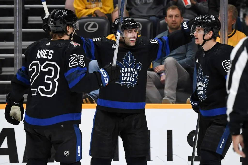
5. Toronto Maple Leafs
Mike: 11th
Scott: 1st
Colton: 8th
Colton: I have always wanted a black Maple Leafs jersey. Despite my ranking of 8th, I still think Toronto nailed it with these ones. It’s clean and simple. Not to mention, it also incorporates inspiration from Toronto’s own Justin Bieber.
Mike: These are perfectly middle-of-the-road uniforms that are undeniably derivative of some of the better black jerseys on this list. I like how you can wear them inside-out, but that doesn’t actually change how they look on the ice. They’re fine.
Scott: I’ll admit my bias here, but not because it’s the Leafs but because I’ve always said that the Leafs should do a black and blue jersey. The mad lads did it and I couldn’t be happier. I especially like the fact that it just introduces another color into the Leafs’ repertoire outside of blue and white (and green for St. Pats jerseys). It’d be cool if they incorporated the black-and-gold inside-out portion of the jerseys into games, like maybe inverting the jerseys for the second period when they wear them, but this is a win in my books.
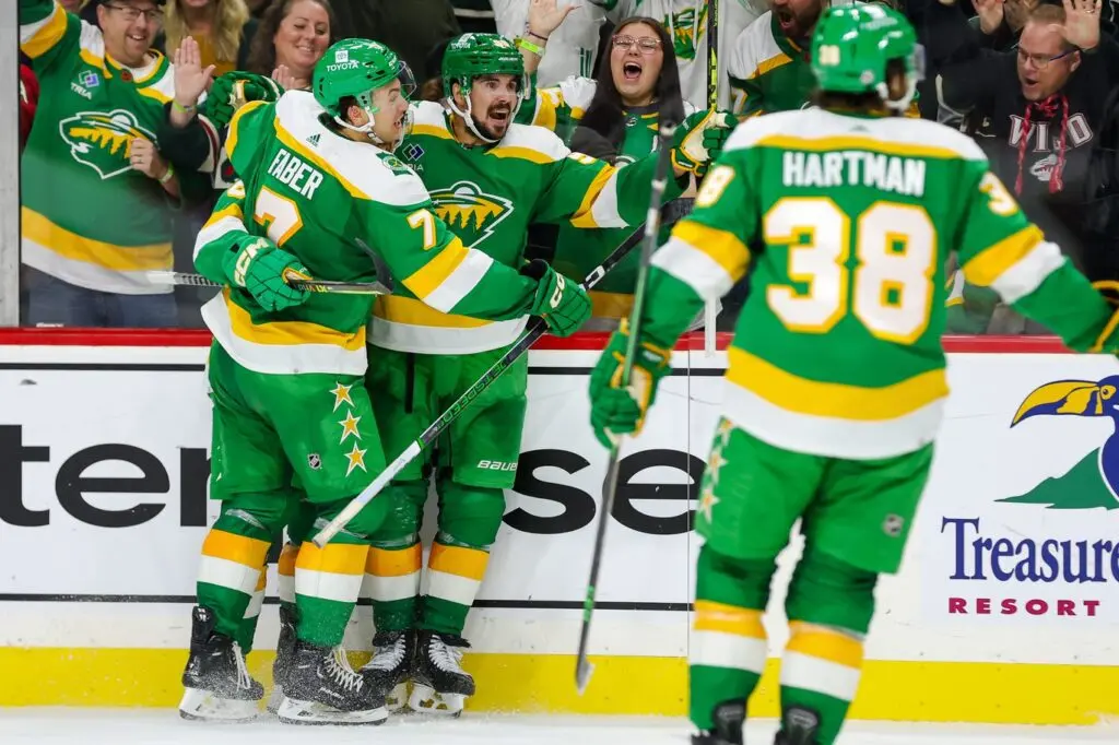
4. Minnesota Wild
Mike: 8th
Scott: 4th
Colton: 5th
Mike: These are good, but not great, in my opinion. I think I actually preferred the white version of these we saw back in the 2020–21 season. I also don’t love co-opting a previous team’s color scheme for an alternate uniform, but this isn’t particularly egregious. I do love the stars on the pants, though.
Scott: It’s a fun retro look that I think uses a slightly more interesting color scheme than the team’s current primary uniforms. That said, I also can only think of Subway when I see them.
3. Buffalo Sabres
Mike: 3rd
Scott: 9th
Colton: 1st
Scott: Again, my opinion differs than the other two here, but let it be known that my No. 2-13 jerseys were all super close, and the only reason why I had this as low as I did is because while it is a very nice look, I just prefer their royal blue and yellow home jerseys more.
Mike: It’s dawning on me that I really seem to like black alternate jerseys. I love the chaotic striping and italicized lettering on these guys. They’re the Sweet Chili Heat Doritos of hockey uniforms.
2. Calgary Flames
Mike: 1st
Scott: 8th
Colton: 2nd
Colton: Blasty is just iconic. In my opinion, it’s one of the most creative jerseys in hockey. As a kid, it always stood out from the rest due to its fiery look. How can you go wrong with a horse breathing fire?
Scott: As I’ve said before, how I like the alternate jerseys compared to their home jerseys was a big factor for my higher rankings, and as good as Blasty is, it just doesn’t beat the classic red, yellow, and white jerseys for me. If the Flames still used their old black-accented uniforms, Blasty wins for sure, but this one isn’t quite as close for me.
Mike: I see it, I like it, I want it, I got it. As much as I find this iteration of the Flames difficult to watch, they gain back a lot of goodwill whenever they hit the ice wearing these uniforms. The logo, the color scheme, the pants, the classic Mission: Impossible font … it’s all perfect.
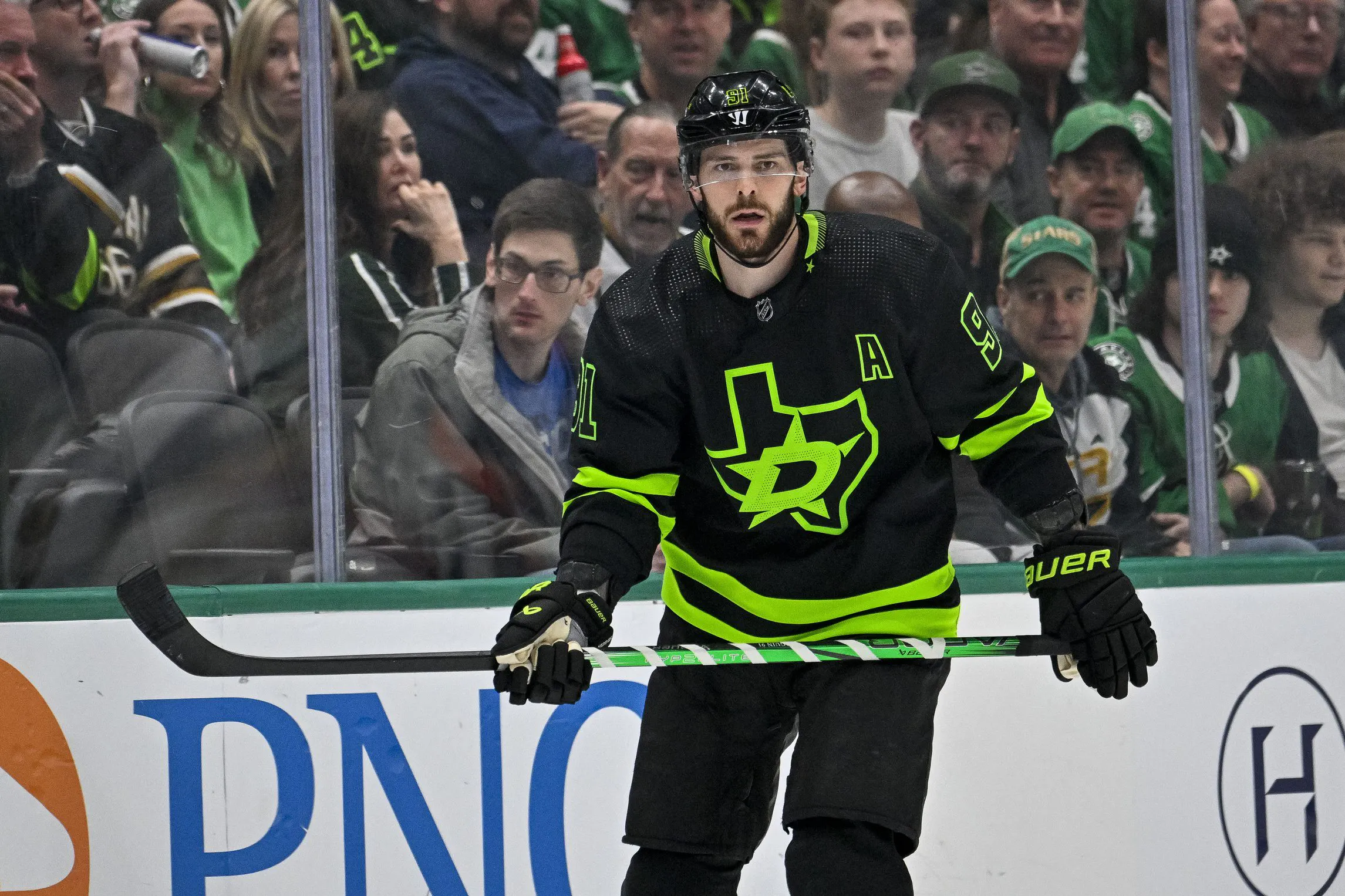
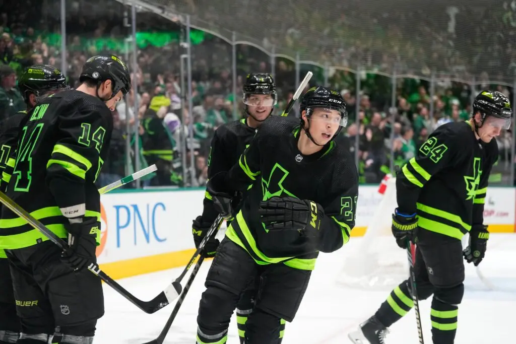
1. Dallas Stars
Mike: 4th
Scott: 2nd
Colton: 3rd
Mike: Although none of us individually think Dallas’ alternate uniform is the best in the league, it’s the only one which united the three of us in putting it in the top five. It’s easy to see why it’s so popular with Stars fans. The neon green contrasts perfectly with the black base to create a look that is both cohesive with and distinctive from the Stars’ primary look. Bonus points for the laser-cut shading in the crest and numbers!
Scott: Once again, I’m admitting my bias for black jerseys with a contrasting color. This is about as contrasting as it gets, and I love it. The neon green in particular might be the most interesting shade on an NHL jersey right now, and I wish more teams experimented with stuff like that.
Mike: The only thing that could make these jerseys any better is if they actually glowed in the dark, like those Vegas Reverse Retro jerseys from last season. Of course, that neon green is so bright that it might not need any artificial luminescence to achieve that sort of effect. What a cool uniform, man. It’s definitely a worthy No. 1.
_____

Discover Betano.ca – a premium Sports Betting and Online Casino experience. Offering numerous unique and dynamic betting options along with diverse digital and live casino games, Betano is where The Game Starts Now. 19+. Please play responsibly.
Recently by Mike Gould
- The Sell-O-Meter: Which NHL bubble teams should consider pulling the plug?
- The Patrick Kane signing is a very risky bet for the Detroit Red Wings
- Assessing the most glaring needs for six top 2024 Stanley Cup contenders
- Four teams in need of shakeup trades early on in the 2023–24 season
- Free Agent Stock Watch: Elias Pettersson angling for huge payday with great start
- The Arizona Coyotes’ top line of Keller, Schmaltz, and Hayton is one of the NHL’s best
- The ultra-competitive Central Division playoff race is already taking shape
- Three young defensemen set to take off with increased responsibility in 2023–24